Friday, July 30, 2010

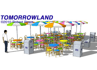
Tomorrowland Tables


One of the most difficult illustrations in theme park design involves restaurants.  Tables and chairs, laid out in proper perspective, can be a very time consuming task.  Then, after the layout is complete, the art director will inevitably want to look at the space from another point-of-view.


SketchUp makes this task simple. Illustrated here is a grouping of tables and chairs based upon those found in the 1967-version of Tomorrowland Terrace at Disneyland (note the change of perspective between the two images). For this model I made only one chair, one table, and one umbrella. The replicated elements are given assorted colors, and spaced just as the interior designer would want them. The grouping can be viewed from any angle until the art director is happy. Adding people is actually the easy part, for any capable illustrator, and they can be added in later through Photoshop.

Perhaps, someday, I’ll build the rest of the restaurant to go along with the tables.

Thursday, July 29, 2010

The 'burbs


In 1989, the Maxim house, at Universal, got a major renovation for the Tom Hanks feature film the ‘burbs.  The renovation was intended to alter the house just enough so that it would not be instantly recognized as the Munsters house.  Also, a long porch was required, for the character of Ricky (played by Corey Feldman), to watch over the goings-on in the neighborhood. 

Unfortunately, with the change came an unusual architectural anomaly at the tower.  In the original design there were tall windows midway up the tower, suggesting that it might have housed a stairway to the second floor (most of the interior of the house was not seen in the first feature, So Goes My Love).  But with the redesign, including a porch, the second floor windows are too low.  There is not enough head clearance between the first and third floor to accommodate a room.

For the television series “Desperate Housewives,” the house was completely rebuilt in a new design, on the old foundation, but the window problem remained.

For this rendering I have modified the Maxim house SketchUp model, and changed the color.  The house would be painted gray after The 'burbs feature and remain that way through the first season of “Desperate Housewives.”

Someday, I will make the latest modification into the “Desperate Housewives” version, although, there is no ornamentation from this version of the house that will be saved.  The new model would simply start over.

Wednesday, July 28, 2010

Dragnet


After “The Munsters” moved out of the Maxim home the house had to be cleaned up to act as a respectable background house on Colonial Street.  Gone were the bat-vane weathervane, the foreboding fence, and finally even the iconic front door.  In 1979, the short-lived sit-com “Shirley,” starring Shirley Jones, used the cleaned-up version of the house as their Lake Tahoe home. 

In 1981, Colonial Street at Universal Studios was moved from a spot nearby the Los Angeles River, to its current location in the hills above Universal’s Denver Street, and Elm Street.  When the houses were first moved a few changes were made.  In the case of the Maxim House (better known as the Munsters house), the screened porch and back porch never made the move.  The location chosen for this house was too small and these wings would have gone off the edge of the cliff.

The house continued much as it appeared in “The Munsters” although in this cleaned-up version.  It was mostly used as a background house and it appeared in “The New Leave it to Beaver,” also known as “Still the Beaver.”

In 1987, the house was featured in the film Dragnet, as the home of Granny Mundy.

For this SketchUp drawing I have removed the iconic Munsters elements and created a new lot for the house to sit upon.  A corner of the garage can be seen in its new location.  Behind the fence is the edge of the cliff and a spectacular view of the San Fernando Valley (not depicted in this rendering).

Tuesday, July 27, 2010

The Munsters Revisited


Today, I have posted another version of the Munsters house.  One of the best things about SketchUp is the easy ability to view models from any angle and in different styles.  I try to choose rendering styles that match with the theme of the building.  This rendering uses one of the Style Builder Competition Winners.  It is called: pencil edges with whiteout boarders.  I have edited this style to include face settings, displayed with shading and texture.  I added a skyblue sky and shadows to give the rendering a sunny look.

Yesterday’s style was from the Assorted Style menu.  It was the PSO vignette that gives a foggy, somewhat spooky look to the rendering.

Monday, July 26, 2010

The Munsters


In 1964, the Maxim Home, at Universal Studios, was greatly redesigned to act as the spooky home of Herman and Lily Munster.  The top of the tower was greatly redesigned.  And a balcony was added to the second floor window under the Dutch gable.  With its half-cocked bat-weathervane and smoke-billowing chimney the house is complete.  Just a few additions to the yard, like a dead tree and foreboding fence, really set the scene.

This image was created in SketchUp using studio drawings as reference for main details of the original Maxim home.  Many of the additional details from “The Munsters” conversion needed to be estimated from reference photos and television episodes.  Although this image focuses on only two sides of the house the model includes the other sides of the house and the garage.  The lightening strike and the logo have been added in Photoshop.

Sunday, July 25, 2010

The Brass Bottle


In 1950, a new Universal backlot street was created near the Los Angeles River.  The street was called Colonial Street and the Maxim house, slightly redesigned, became one of four homes hiding the river’s edge.  It appeared in a number of films and television series.  The last film that it appeared in, without major change, was The Brass Bottle

In the 1964, film Tony Randall discovers genie, Burl Ives, in the title bottle.  Barbara Eden plays Tony’s girlfriend (not a genie).  The film is available on DVD only at Amazon.  For this film the back porch and a 4-camel garage were added to the house.

Saturday, July 24, 2010

So Goes My Love


The Maxim Home was originally constructed at Universal Studios on Stage 12, in 1946, for the feature So Goes My Love, starring Don Ameche and Myrna Loy.  In the film Don Ameche’s character, Hiram Maxim, lives next door to Myrna Loy.  The façade is therefore referred to as the Maxim home.

In this SketchUp drawing the front yard is a re-creation of what was built on the stage.  The back of the house and the unseen far side were not built for the film.  This house would later become one of the most recognized homes in television.

Friday, July 23, 2010

Bewitched


The home of Darrin and Samantha Stephens used in the television show "Bewitched" is located on the backlot of the Warner Brothers ranch. Just down the block from this house (not across the street) is the home of snoopy neighbor Gladys Kravitz. The Kravitz home later became the home of "The Partridge Family."

This image was created in SketchUp using dimensions that were either field measured (off the backlot set), or estimates from other reference photos and images. This entire model was created in just three days. The logo was added in Photoshop.

Thursday, July 22, 2010

Gotham City Plaza


The Gotham City Plaza was originally constructed on the 20th Century-Fox studio lot in the mid 60s. These façades stood in front of existing studio facilities and created a modern Century City like area referred to on drawings as New York Street, although this area was very unlike New York City at the time.

Gotham City Plaza was featured in the “Batman” television series; the Batman movie released in 1966; and in “The Green Hornet” television series. In “The Green Hornet” the entrance to the Daily Sentinel newspaper office and television studio was through the door shown at the rear of the Batmobile. Britt Reid (a.k.a. The Green Hornet) was the publisher and owner of the Daily Sentinel and DSTV.

This SketchUp drawing was created using original studio drawings for dimensions. Color comes from limited reference photos. To add additional life to the image a Batmobile was found in Google’s 3D Warehouse. The Batmobile, or Batmovel was created by Marcelo Negrão and it appears to be quite accurate. The highlights on the car were added in Photoshop along with the logo.

Wednesday, July 21, 2010

Hanging Miniature Continued


The last two posts showed how a hanging miniature effect is achieved in filmmaking. The hanging miniature effect makes small objects appear to be part of the full-scale scene when photographed from the proper angle. These drawings were created in SketchUp to illustrate the effect.

The first image shows the miniature space rocket landed, with its miniature command module taking off for a trip back to Earth. The foreground space rocket and flying command module are actually one-quarter the size of the US Moon Station cluster. But from this perspective all modules appear to be the same scale.

The second image leaves the camera in the same position, but this time the hanging miniature and its platform have been removed. Apparently, in its place, is a full-sized space module with a door. In the 20th Century-Fox comedy, Way… Way Out, this is the space rocket that Jerry Lewis and his new bride Connie Stevens arrived in. The crew that they replaced left in the command module.

The third image shows the stage layout for creating such an effect. The US Moon Station always remained in place. The full-scale module was moved into position only after the miniature work was complete. The hanging miniature and its platform were positioned at the far end of the stage and twenty-feet above the stage floor, along with the camera. The hanging miniature was placed 60-feet away from what would appear to be its full-scale position.

These images illustrate a cinematic way to make dreams come true.

Tuesday, July 20, 2010

Hanging Miniature


A hanging miniature is the term used for in-camera photo effects, where a miniature is carefully placed to give the illusion that it is a full-sized part of the scene. These effects have been used almost since the beginning of filmmaking. Today, the same illusion is usually achieved with computer graphics. But even today computer graphics can be more expensive than simple model building. This is a film effect worth knowing.

This first image shows a space rocket coming in for a landing. The cluster of modules in the background is the US Moon Station from the 20th Century-Fox, Jerry Lewis comedy, Way... Way Out. The rocket coming in for a landing is actually a miniature (even in this SketchUp model).The single lens of the camera has no depth perception so, in proper focus, both objects appear to be on the same plane.

The second image shows the miniature landed on the hanging miniature base. This base is actually on the other side of the stage, far in the foreground, 60-feet away from the US Moon Station. Our weathernaut is leaving a station that appears to be about the same size as the space rocket. But the space rocket in the foreground is only one-quarter scale.

Monday, July 19, 2010

Way... Way Out!


The Moon Station was designed for a 20th Century-Fox Jerry Lewis comedy co-starring Connie Stevens. In the film the newlywed couple is sent to the moon to watch the Earth’s weather and get to know each other all at the same time. Soon after production ended Irwin Allen found use for the various parts of the station in his television series Lost in Space.

The SketchUp illustration was created using studio drawings for the details. Sadly, drawings were not available illustrating the exact positioning of the various modules. In SketchUp the modules were overlaid onto photographs at various angles in order to estimate the module orientation.

This second view shows the US Moon Station with the space rocket, that brought the couple to the moon, landed.

This SketchUp model was updated to include an illustration of the hanging miniature, in-camera effect, used in the film. Various view of the hanging miniature process will follow.

Sunday, July 18, 2010

SketchUp and the Disneyland Hotel


Since completing my assignment with Universal Singapore I have continued to develop my skills as an artist by moving into the 21st Century. I have learned the three-dimensional computer-modeling program SketchUp and it is truly amazing. With this program I have eliminated the need for a model builder and illustrator to translate my work into terms most can understand.

It is just as easy for me to design in 3-D and I have greater control of the final product.

Most of the projects presented in SketchUp are exercises for my own education and to demonstrate my skills. The first examples can also be found on my Website. As interesting new creations are generated I will present them here as well.

Here is one of my earliest models, the Disneyland Hotel.

The Disneyland Hotel began a series of two story motel-like units. In 1962 the first eleven-story tower building was constructed. This building would later have an extension doubling the width and number of rooms before two more towers were built.

The SketchUp rendering is based entirely upon published dimensions and guesswork.

Saturday, July 17, 2010

Far Far Away


I couldn’t escape from Fantasyland for long. A small team of independent contractors was assembled to design Universal Studios Singapore and I was contracted to design a flying dark ride. Although I continued with design for the dark ride throughout my stay on the project, it remained unrealized.

The project had the most talented individuals that anyone could have assembled, but it was severely understaffed. I was asked to assist art director Catherynne Jean in the Far Far Away area. Catherynne was responsible for all of the Dreamworks areas that included ideas from Madagascar, Kung Fu Panda and Shrek.

For Shrek it was decided that the land of Far Far Away should be recreated including King Harold’s castle. The original park design was mostly a roughed-in plan showing the location and square footage for a village and the castle. Food and retail would also be included, as was a 3-D theater for Shrek and a smaller theater for a show, starring Donkey.

As usual, I began with research. The films were filled with wonderful locations and rich detail. I decided that it was best to try, as much as possible, to match what was seen in the films. Our village area would become the Romeo (Rodeo) Drive village seen in Far Far Away. This medieval Beverly Hills provided a perfect setting for the necessary food and retail establishments of the land.

The Shrek show was to be located in the castle and I did much careful research to make certain that the castle would match that of the film. This actually became a problem for Universal management. The castle in the film is derived from actual European castle designs, but it is an intentional parody of Disney castles. As a result management feared that we would be accused of copying Disney. In fact, it was the close attention to duplicating what was seen in the film that saved us.

Believe it or not, since the Shrek films are computer-modeled in 3-D the designers actually have to know what scale everything is. Drawings from Dreamworks claim that Shrek is seven-feet-tall and doors on the castle and in Far Far Away must be scaled to accommodate him. There were drawings that showed the size of every door, window and building in the movie. Unfortunately, we didn’t have access to them while I was designing. Everything was guesswork.

But I did more than guess. Shrek is huge compared to the citizens in Far Far Away. If one compares a citizen to the buildings the doors can be eight to ten-feet tall and four feet wide. But next to Shrek, the door looks right. We didn’t have the space to make the land its true scale. Everything had to be scaled down. The best part is that by doing so the land feels friendlier, just like Main Street at Disneyland.

The same was true for the castle. It was dramatically scaled down and it's still enormous.

I designed and altered the master plan for this area to improve the guest’s flow. I figured out all of the building facades and scale along with the castle. Because the film was designed in 3-D on computers many parts are replicated over and again. It was easier to execute the final drawings with computer-aided design. Film and television set designer Daniel Saks was brought in to assist me. He did all of the computer drawing and as a result discovered endless design details that needed decisions. He is very skilled and often had the problem solved before it came to my attention.

Neither Daniel, nor I continued into the field. Catherynne and her team did a marvelous job of bringing the world of Shrek to life.
Secret Project


I’ve spent much of the past ten-years working a Secret Project along with my business partner, Jon Foster. To manage the project we created a company called The MILTON PAUL Company. Take a look at our Website to learn more about our company and nothing about our secret.

All that I can say about the project is that, “It is a highly-themed entertainment resort, with a unique twist.”

We continue in our search for investors, but today’s economy has dramatically curtailed our prospects. We nevertheless remain optimistic.

Friday, July 16, 2010

Irwin Allen


I’ve continued to consult on a number of interesting projects, beyond the field of theme parks. One of those projects was research for Space Productions and Irwin Allen Productions. As a writer/researcher I developed a Style Guide to assist in licensing merchandise.
Of course, it helped that I am a huge fan of Lost in Space and all of the Irwin Allen properties. Much research can be found in my personal collection. I also had access to research at Twentieth Century-Fox and the UCLA special collections archives. One needn’t know all of the answers so long as one knows where to find them.

The Brady Bunch


I had provided some free consultation for an episode of “The X-Files” where a re-creation of the Brady Bunch living room, stair hall and kitchen appeared. When Old Navy decided to run an ad campaign using re-creations of the Brady Bunch stair hall and backyard I was again contacted. My only real work was research, but it is because of my well-known reputation as an expert in mid-century film and television set design and scenery that I was contacted.
Later I again provided consultation for a re-creation of the Brady Bunch stair hall for the Los Angeles County Fair. The Fair traditionally hosts an exhibit of living rooms created by local designers to showcase both their talent and the wares of local retailers. In recent years this exhibit experienced declining attendance so the Fair decided to add some pop-culture into the exhibit.
Due to square footage constraints it was determined that the entire Brady Bunch living room and stair hall could not be re-created. Because of its iconic recognition the stair hall would provide the best photo opportunity. The result was that the Fair’s living room exhibit had a great upswing in attendance and the Brady Bunch stair proved to be a great draw as evidenced from its long queue. The guests came for the pop-culture and then stayed on to see the rest.
The photo is from the Old Navy set.

Spain – Escape from Fantasyland


After completing my assignment at Universal’s Islands of Adventure and Seuss Landing, I began consulting – mostly for Universal Creative. I worked on some unrealized projects, but I also worked on a project called Templo del Fuego for Universal Studios Port Aventura in Spain.

Finally, I was out of Fantasyland. Don’t get me wrong I truly enjoyed all of my work on the various projects in my career, but so many of them seemed to be Fantasyland in nature. Snoopy Studios, and Dr. Seuss are just more of the same kind of delightful whimsy that Fantasyland embodies. I can easily recreate these styles in such a way that it looks much like the work of Charles Shultz, Theodor Geisel, or many of the best Disney animators. But I can do more too.

Templo del Fuego gave me a chance to do that in a show that could be characterized as Backdraft in an Aztec tomb. The show would include all of the pyrotechnics of Backdraft in a mysterious archeological setting. Live actors would work within the environment to bring the show to life.

The tomb itself would be like none other. We used research from Aztec and Mayan architecture, but we also were looking for an otherworldly alien look to add in. The project was a huge challenge due to many restrictions. Still the team, under my leadership, managed to design both the interior show and façade in a very short span of time.

The lead art director and a production designer went on location to direct the final show.

This is the entrance to a small tomb. Beyond this point was the queue area, holding area, preshow, and main show in a huge themed show building. The whimsy is clearly missing this time.

Seuss Landing


By the time that Seuss Landing at Universal’s Islands of Adventure was complete I had art directed seven facades. The final buildings are the icons that make Seuss Landing what it is today.

Here is just one example of a completed façade. Visit Universal’s Islands of Adventure and Seuss Landing to see more of my work – it will be all around you.

The Colorful World of Dr. Seuss


Before the Islands of Adventure project moved to Florida, art director Wes Cook had painted color elevations for all of the buildings. The colors were carefully chosen, often using the books as reference. The two-dimensional paintings seemed to cover every side of the building. But Seuss Landing is a 3-dimensional organic land growing in the Florida sun.

Colors that had high contrast on paper appeared pale in the field. Two-dimensional drawings have lines at corners where Seuss buildings don’t have corners. Figuring out how to respect Wes Cook’s original vision while working with the reality in the field presented the ultimate challenge for making dreams come true.

I convinced management that the models had to be painted in order to solve the problems at a small scale and a small price. Repainting a giant green ham was expensive (I know because it happened). Colors had to be pumped up.

The stripes on the cat’s hat are a deep salmon in the book. That’s fine in print, but in the Florida sun the primer coat that matched the book looked pink. Management asked me repeatedly if this was the right color. There was only one right answer, “No, that’s just the primer.” I chose a new deep red that actually fit what everyone had in mind.

Here is a photo for one of the models after it was painted. I had permission to the have the models painted, but I only had one painter assigned to the job of seven models. I ended up painting on much of the models myself in order to get the job done in time to be useful.

Shaping Up Seuss


I had seven facades to art direct while I was in Florida working on Seuss Landing at Islands of Adventure. The sculptors did a brilliant job of carving huge blocks of foam into the world of Dr. Seuss. The foam thickness varied from 2-inches to 2-feet. As the Styrofoam was shaped white beads were shed and floated about like snow. But this was Florida in the summer and, even though it looked like Christmas, this was very hot work.

Here sculptor Joe is shaping a header over a window on the Emporium retail store. Generally the talented team of six sculptors could look at the ½ -inch scale models, that we kept for them nearby in the field, and turn it into a full-scale reality. On rare occasion I tried my own hand at the work, especially when it came to wrinkles.

After the foam was carved into shape it was covered in a thin coat of plasticized concrete and fabric mesh as a weather-tight hard-coat. Then it could be textured and ready for paint.


Making Seussian Dreams Come True


The easy part of making dreams come true is the dreaming. The hard part is understanding the truth and working with it. Among the many truths to building a theme park is the need for brick and mortar, nuts and bolts, to actually be fashioned into something unique and different. And it takes people to do that job.

Islands of Adventure, Seuss Landing had an overall construction contractor that hired a façade sub-contractor, which hired a sculpting sub-contractor, to make the dreams come true. Fortunately, I had a good working relationship with everyone. The façade sub knew that this project would be high-profile enough that it would get them more business, so long as it was successful. They knew that if they made me, the art director, happy it would be successful.

The construction day began at 7:00am. I would arrive in the field at about 9:00am. By that time things were really moving and questions had already come up. Some days, as soon as I arrived, a line would begin to form with workers and questions. I would do a quick triage to rank importance. Sometimes I could just stop by a particular building a little later. Sometimes I could give a quick answer to a known situation. Other times I had to go to a location immediately because work had stopped pending my input.

In any given day I answered hundreds of questions to keep the work moving. Most of my time was spent with the sculptors (or carvers) that shaped huge blocks of foam into wild Seussian creations.

Construction ended at 3:30pm and I would head back to the office to catch-up on paperwork and, when necessary, draw up solutions to the problems faced in the field. My day never ended before 7:00pm. When a drawing was required it was usually completed and delivered the next day.

Here is an example of just one such drawing and its final solution.

Thursday, July 15, 2010

Back to Seuss


During the year that I spent with Universal Studios, Japan, the Islands of Adventure project had moved into the field and into construction. Seuss architecture was very challenging and art director Gary Lee had long wanted me to assist him with it. I couldn’t relocate along with the project because I had not been figured into the original budget. Now, a year later, things looked different and I was asked to rejoin the project.

I was faced with a dilemma: stay with Universal Studios, Japan and fully realize the Snoopy Studios project; or go to Florida to finish up on Islands of Adventure and Seuss. It was not an easy decision but I knew that there was much more talent available in Hollywood (where we were designing for Japan) to replace me. In fact, I had a friend that I could call upon that I knew would respect my original vision. I called on Kent Elofson to replace me with Snoopy Studios. Kent not only followed my original direction he actually made it better.

This left me free to pursue the Seuss project.

The rest of the team had been out in Florida for a year. I could only imagine how far behind I would be when I arrived and how far along the project must be by now. To my surprise what I found when I arrived was dirt.

My time had been spent much more productively in California. I had designed a whole new land for Japan while the Seuss team sat around and watched tractors push dirt (actually I know that they were working hard, it's just that there was little to show). Now it was time to dig in (so to speak) on Seuss.

The image shown here is actually about six-months after I arrived. Here the Green Eggs and Ham building is rising out of the dirt. Painters are painting the fork while a high-reach is available. Everything else is just primed. I'm standing on the ground radioing instructions to the painters and taking pictures. Of course, when I first arrived nothing was vertical.

Monday, July 12, 2010

Inside of Snoopy Studios


When I designed Snoopy Studios (called Peanuts Studios in early concept) for Universal Studios, Japan, I wanted to ensure that the area would be kid-friendly. By putting the majority of the elements indoors, into a soundstage, I could include things that couldn’t work outdoors.

The indoor environment also offered limitations that worked in my favor. The original outdoor rollercoaster design was most challenging. It would likely have excluded the same guests most interested in the characters: small children and their grandparents. Once the attraction was moved indoors only a kiddy-coaster would fit. Although the thrills are mild the speed actually seems greater indoors (it’s the close proximity to nearby walls and objects that causes the illusion).

The Charles Shultz comic strip has no environments to work from, but it does have a distinctive drawing style. It was easy to translate this style onto backdrops and comic set pieces in an indoor environment.

Also indoors it is easier to create challenging interactive games. Video monitors don’t work well outdoors. But we didn’t rely solely upon video monitors anyway. Our studio needed a number of studio departments. A Music Department was created that offered interactive musical instruments. An Art Department would allow guests to color Peanuts characters. Guests could control Special Effects over at Charlie Brown’s house. And tired guests could sit back and enjoy Peanuts cartoons at the Screening Room while others burned off energy playing in Spike’s Western Town.

I really enjoyed designing and working on Snoopy Studios. This was a great project, but I had another great project offer too.

Snoopy Studios Environment


Theme parks are all about environments and how the guests view and interact with them. Charles Shultz’s Peanuts comic strip, although terribly witty, is all about ideas and characters. There are no environments in the Peanuts world save Snoopy’s doghouse. And given the fact that Snoopy is so often pictured sleeping on the crest of the gable, even this element is depicted more two-dimensional than three-dimensional.

When I was given the task of designing Snoopy Studios (called Peanuts Studios in early concept) for Universal Studios, Japan I needed to find a way to solve the environment problem. By putting the main show indoors it could become a comic outdoors. This controlled environment would allow for many more opportunities.

From the start the plan was to theme the area as a studio. I took the idea to its furthest extreme. The main attraction and the retail location would be designed as soundstages. In the remaining outdoor area the program called for a waterslide attraction. For a studio this area became a Water Stunt Slide apparently rigged onto the studio water tower.

Next to this I designed a very simple (small-kid-friendly) hedge maze. Within it I included the Great Pumpkin patch. This area became the studio Greens Department. At the end of the maze was a greenhouse filled with a number of appropriately themed interactive amusements. The greenhouse was carefully situated so that it could be utilized separately of the maze on inclement days.

Greeting guests to the area was a Snoopy fountain and a Studio arch. The new plan added a sense of place to the area as well as improving guest flow.

Snoopy Studios


I was working for the Universal Studios, Japan project on a live show called Animal Actors, when I was asked to take on another attraction as well. Snoopy Studios (called Peanuts Studios in early concept) was to be an area geared primarily to children. The area would function similarly to Fievel’s Playland at Universal Studios Florida.

When I first started on the project a preliminary concept plan had already been generated and it was my task to make this concept work. When Japanese investor’s first reviewed the concept they were less than enthusiastic. Their biggest concern was that the area was located entirely outdoors. The weather in Osaka, Japan is very hot and humid in the summer, and sometimes snowing in the winter.

The critique offered me a chance to address their concerns along with a few of my own. First, I wanted to ensure that the area would be more kid-friendly. But also, I was having great difficulty with the Snoopy theme in an outdoor environment.

I created a new plan for the area and I was able to get approval from management, but they remained wary of the investors and wanted to ensure that the ideas were fully understood. I was given six-weeks to turn a single two-dimensional plan into a very small scale show model.

I tried to explain to management just how big this challenge was, but in the end I decided that it would actually be a very fun opportunity. We contracted with Rijn & Reisman, a model shop that I had a very good working relationship with. I had to, single-handedly, draw every building and set element in the land. The detail necessary for a model was nearly as much as for building a final project.

The model shop couldn’t wait until I was done drawing and meet the deadline too. They had to start building while I was still drawing. When I brought them the first drawing I got my first surprise. They asked me what color the floor was. I wasn’t sure what was going to sit on the floor and they wanted to know what color it was!

The model had to be drawn, painted and built all at the same time. But six-weeks later it was ready to go and on a plane to Osaka. This jewel of a sales tool worked perfectly and the final project closely resembles its earliest concept.

Saturday, July 10, 2010

Preview Center Resorts Area


Resort hotel accommodations were an important part of the overall Disneyland Paris (then known as Euro Disneyland) package. The resorts needed to be highlighted in the Preview Center and an outside design group had been hired to cover this area as well as the entire project. Management had not been too happy with the designs and they brought me in for the Disney touch.

The original intent was considered too cold with painted glass panels and industrial metal fastenings. We also knew that the space would, at times, become quite crowded making the sharp surfaces that much more problematic.

Unfortunately the budget had been entirely spent on the original design. When I came in to fix things I had to work with what I had. We scrapped many of the glass panels, but for the resort displays we decided to keep them. This would help to differentiate the resort hotels from the theme park.

Still, the area was too cold. So I had props brought in. The area was positioned in what was really an overflow area for viewing the project model; so many guests had their backs to this area while listening to the presentation.

Nevertheless, I was surprised by the positive responses that the entire showroom, in fact that the entire Preview Center enjoyed. For me though the best compliment came from Jim Cora the president of Disneyland International and my old boss. He had been very kind to me over the years, this was my chance to repay him and he assured me that I had not let him down.

Preview Center Model


The Disneyland park, Paris (known as Euro Disneyland at the time) Preview Center was a very fun and challenging assignment. Management had not been happy with the original design and I was brought in to fix it.

Showmanship is an important Disney standard and when I first saw the Preview Center layout I knew exactly where the showmanship was lacking. The overall project model was to be the highlight, but it had been placed nearly at the entrance of the room. The cast members were expected to deliver a spiel near the model, but as soon as they were done they would have to be across the room to let guests into the theater.

My operations and design background helped me to solve the problem. The model needed to be at the furthest end of the room, right next to the theater entrance doors. There wasn’t room to place the model in this location if it remained flat, but that was to my advantage. The ceiling was higher in this area so I had the model raked up on a steep angle. This angle took up less space, gave a better view, and added some drama to the presentation.

Lighting above the model could illuminate exactly the part that was being described, or the whole model as necessary. When this part of the show started the guests were interested to gather around. The guests naturally formed rows in front of the model as the spiel was delivered. When the spiel was done, it was time to enter the theater; without knowing it, the guests were queued up just outside the doors ready to head inside. You’d think that we had planned it.

That’s showmanship.

Preview Center Hostess

The Disneyland park, Paris (Euro Disneyland at the time) Preview Center had a showroom lobby that led to a theater. Within the theater was the main show – a film presentation of the coming attraction. The original design team had designed a marquee with graphics; and the doors were placed in the center of the showroom space.

This would not have been my first choice when planning the guest flow, but I was brought in to rescue the project and there was no money for structural changes – I had to work with what I had.

In order to reach this point in the room I had created a u-shaped path past displays of the various lands. This point needed to be the end of the journey but it was only half-way through the room. The problem was solved by careful placement of the overall model for Disneyland Paris.

After the theater show was over guests would leave through doors that led… you guessed it – to the gift shop. A snack bar was located just outside in a separate room. This gave the Preview Center a chance to train cast members in the three main operational divisions.

The cast members that worked at the Preview Center were the best. Each one spoke French and English and some spoke other languages as well. They were all very friendly with me and the other guests visiting.

Preview Center Frontierland


For the Disneyland park, Paris (Euro Disneyland at the time) Preview Center I had wanted to add operational costumes on display. These costumes would add life to the exhibit and help to cut down on the hard edges. When I was assigned to rescue this project I knew that there was no budget to work from so I tried to choose things that were easily available.

Costumes were easy. Dress dummies to put the costumes on were not. Like furniture to display props upon, dress dummies are not free and they are not something that just happens to be sitting around. The manager from the wardrobe department was a friend of mine from my Disneyland days. He gave me the bad news and said that he would figure something else out. I had resigned myself to whatever they could come up with. On the last day of installation the costumes showed up – on dress dummies!

For the artwork on the walls copies of existing art were mounted on foam core board for a rimless look. Hidden frames behind the art made them stand out away from the wall by 1, 2, or 3-inches adding some interesting shadows and depth. Here in the Frontierland area the pictures showoff the interesting shadow patterns created by hidden frames behind the art.

Preview Center Fantasyland

The big attraction for Disneyland park, Paris (Euro Disneyland at the time) is Le Chateau de la Belle au Bois Dormant (Sleeping Beauty Castle). When I was drafted into rescuing the Preview Center I knew that the castle model needed to be located in a place of honor. The model was situated in the center. To emphasize the importance I had a sky painting placed behind it. And just in case this didn't seem important enough two-toy trumpeters from the Pinocchio attraction were positioned on each side, ready for a fanfare.

The position of the castle was such that it would likely be the first thing one would see when entering the room, even though the other displays would attract ones attention while passing by. In the center of the room directly in front of the castle model was a Dumbo ride vehicle. The vehicle was mounted on a carpeted platform allowing guests to sit inside for a photo opportunity. A shot of your child could easily include the castle and sky painting.

Preview Center Discoveryland


I had been elected to rescue the Disneyland park, Paris (Euro Disneyland at the time) Preview Center. The main area of interest was the showroom lobby that would be filled with displays. The original layout for this space had been very chaotic with little consideration for audience flow thorough the space. Almost immediately upon entering the guests would have come upon a large project model. The model placement would have stopped traffic and created two dead ends at each side. A low ceiling was planned over the model for show lighting.

When I took over I was unable to raise the ceiling, but I made it work to the best advantage. Most of the displays for the various lands were under the low ceiling and this brought an intimacy to the space.

I had no budget to work from. All of the displays were considered to be ‘free’ since they would be actual props or models that would later be installed into the park, or that already existed. The problem is that one can’t just pile those things into a room like grandma’s attic. Displays need furniture to sit upon.

I came up with a very simple solution to the display-furniture problem. The pieces are all simple plywood boxes with wallpaper on the sides. This is the same wallpaper that was being used for the rest of the showroom (leftovers). The wallpaper would help to make the boxes blend into the background and not draw attention. Those boxes needing a top surface would use carpet remnants matching the carpet on the floor.

No one notices, until it’s missing, just how important graphics are. In addition to the lettering above the display each grouping of art and prop requires a descriptive plaque. Graphic designers furnished all of the signage and plaques.

C-3PO waited here patiently for more than a year before being installed in Star Tours, sometime just before opening day.

Preview Center Entry

While trying to rescue the Disneyland park, Paris (Euro Disneyland at the time) Preview Center I was forced to work with some leftovers from the previous designers. Pictured here are some painted glass panels that were intended to fill the entire showroom. The glass and metal look and all of the hard edges is likely what startled management. I used a few of the panels here at the entrance and in the resorts area in an effort to keep the cost down.

I don’t believe that I had anything to do with the displays on these particular panels. Still, they give a feel for the start of the experience.

Preview Center Ticket Booth


The Disneyland park, Paris (Euro Disneyland at the time) Preview Center was in need of rescue from poor design and I was elected to save it. There was no budget to work from. The previous design group had spent the entire budget for the Preview Center. Nevertheless, changes had to be made and the costs… well, I can’t say here exactly what happened, but in the end it didn’t appear to cost anything.

In fact, without a budget I had to design very tight, adding only the most essential elements. In Paris, that included a ticket booth. The French believe that things are only worth what you pay for them. If something is free it is worthless. For this reason the Preview Center needed to sell admissions. The original design had neglected a ticket booth so a prefabricated version was supplied. The metal box in front of the Center would never do, so with a few plywood cutouts it became a Disney ticket booth.

Preview Center Disneyland park, Paris


I had hoped not to have to go backward in this blog and to keep things chronological, but with the addition of the Islands of Adventure Preview Center I happened to remember another Preview Center.

It does seem that I am often brought in to make repairs on projects. That was the case for the Disneyland, park Paris (Euro Disneyland at the time) Preview Center. The Preview Center had been designed by an outside firm – instead of Imagineering. The results lacked the Disney style so important to a first impression.

The entire team of Imagineering art directors in Paris at the time was swamped with their various attractions. In an art director’s meeting it was suggested that we all lend a hand in the Preview Center fix. I knew that design-by-committee was unlikely to aid in any repairs and I suggested that a single art director needed to put in charge. The boss agreed and I was put in charge. This was not the outcome that I had expected, but I did recognize that, despite my overflowing plate, I was best suited to the job.

Jim Cora was the president of Disneyland International. I had worked for him both there and when he was the director of Fantasyland/Tomorrowland at Disneyland. It was Jim who had requested the repairs and I was very loyal to seeing that he got what he was looking for.

This first image is of the exterior for the facility. The building was half completed when I started making changes. There would be no changes to the building interior or exterior structure. I had a showroom, inside of the building that needed my attention.

Friday, July 9, 2010

Seuss People


After completing changes for Caro-Seuss-El and One Fish Two Fish set flats to be used in the Islands of Adventure Preview Center I was asked to add some more finishing touches. With the fun Seuss people that I had added to the One Fish Two Fish cutout the rest of the people planned for the display looked boring. They were just architectural style people in various poses.

This was a very fun exercise of designing people that look like Dr. Seuss might have drawn them himself – but he didn’t. Now, in all honesty, I work from lots of research. I have found faces, feet and maybe even a few whole bodies to add in here. I can’t tell exactly which people came from where. It is intentional that I put Sally and me from The Cat-in-the-Hat story into the picture.