Saturday, October 30, 2010

Gone Fishing

Vacations are a time to take a break from the routine for some new, diverting, enjoyment.  Well it's that time for me.  Of course, for me enjoyment is my work.  I'm starting a new project and for a time I won't be able to make my usual postings.  As soon as I'm back online I'll have more to share.  (No, I won't be able to share anything from my new project.  They are always secret until they open.)

In the meantime, please don't be shy.  Take a look around the blog.  There are 139 postings here and I'll bet that you haven't seen them all.  Choose a topic that you like from the labels on the right.  Or, better yet, head down (on the lower right) to the Blog Archive.  Start at the bottom and check out an entry a day.  I'll be back before you know it.

The attached image is from my Pleasantville model.  Like so much of my work this SketchUp model allows me to explore it from any angle.  I've chosen a storefront and added a sign in the window.  Then I did have to add some blinds to make sure that the place looks closed.  But the sign certainly indicates the promise of return -- probably with big fish and big fish stories.

Friday, October 29, 2010

The Munsters - Bat's-Eye-View

Well, here is my last post for The Munsters house before Halloween.  It's a bat's-eye-view of the house, flying high above.  The lot is a recreation of the original Colonial Street location.  The Los Angeles River was actually directly behind the house, separating the property from the nearby golf course adjoining Universal Studios. This large property was over 100 feet wide and around 50 feet to the front door.  That's a lot of crabgrass.

The roof may look a little unfinished from this view.  That's because the house is based upon the backlot facade.  There was no reason to finish anything that would not be seen by the camera.

This Halloween, if you happen to be flying past The Munsters house, don't forget to swoop in and say Trick-or-Treat.

Thursday, October 28, 2010

Munsters Details - Screened Porch

Here is a hidden detail not often seen on The Munsters house.  It is the screened porch on the far right side. In the Universal Studio feature file So Goes My Love the local fire department thinks that inventor Maxim's house is burning down.  Don Ameche (as Maxim) comes out of the screened porch to explain that it's just one of his inventions smoking.  Of course the irritated fire department ends up turning the hose on the inventor.

In The Munster there is tag at the end of an episode (forgive me for not looking it up) where Herman and Eddie are playing baseball on the side yard.  Lily comes out of the screened porch to remind Herman that he will be late for work.  One pitch from Eddie and Herman hits the ball that ricochets off the wall knocking Herman out cold.  Lily's not worried the car pool from the parlor will be by to pick him up soon.

Wednesday, October 27, 2010

Munsters Details - Front Window

As the Halloween month continues to build to a frighteningly fun conclusion I have just a few more images from The Munsters house to post.  The Munsters seems to be an audience favorite and that's why I've posted so many images of the house.  But my audience of Internet viewers is hard to understand.

My posting of The Munsters Revisited (I'll not link to it here) has had 298 hits as of this morning.  My next closest posting is the Tomorrowland Signpost at 56 hits.  Clearly the audience is looking for images from The Munsters, right?  Well, it turns out that if you use Yahoo images to search almost any variation of The Munsters my image The Munsters Revisited comes up on the first page of images.  Viewers come to the site look at the image and then go.

Some viewers stick around and look to see what else is available.  Few seem to have figured out that, like many blogs, I use labels to help viewers find what they are looking for.  At the bottom of each posting are labels that one may click on to find similarly labeled images.  If you want to find my other television images just click on the label below.  There is also a long list of labels on the right.  Click on Disneyland, or Seuss Landing to find a different assortment of my work.

Finally, don't forget to click on Older Post at the bottom of the page to view (you guessed it) Older Posts.  There are over 135 posts on this blog.

I try to give my audience what they want -- please don't be too shy to look around.  It's open house here every day.

Tuesday, October 26, 2010

Munsters Details - Side Window

The Munsters house was original built on a Universal Studios sound stage for the feature film So Goes My Love.  The house was called the Maxim house, after the lead character.  This side of the house had not been finished for the film since it was not seen.  When the house was moved to the backlot this side of the house needed some attention.  The beautiful window, seen here, also came from the film So Goes My Love.  It also came from the Maxim house, but it was built for Maxim's 2nd house.  The Munsters seemed to like their garden on the over grown side, so this window was mostly covered in shrubs.

Monday, October 25, 2010

Munsters Details - Kitchen Door

Here's another detail image from The Munsters house.  It's the kitchen door near the garage.  The door and the garage were added onto the house for the Universal Studios feature film The Brass Bottle.  Prior to that there was a window where the door and porch are that matched the lower window on the left.

Friday, October 22, 2010

Munsters Details - Bat-Vane

Keeping up a blog of one person's art is not easy.  In fact, if it weren't for SketchUp it would be impossible.  To celebrate Halloween I've been posting images of haunted houses.  Well, mostly The Munsters, but this month I also have a number of images from the Bewitched house.  Once a structure is created in SketchUp there are an infinite number of views that can be explored.  This is a view of the bat-vane weather vane.  This view also shows off the interesting roof line, finials and even the television antenna.

Thursday, October 21, 2010

Munsters Details - Tower Balcony

Throughout the Halloween season I've been posting appropriate images from my SketchUp models.  This week has included an assortment of details from The Munsters house.  The latest is a close-up view of the tower balcony.

This entire top of the tower was added to the existing Maxim house backlot set just for The Munsters television series.  It is supposed to lead to Herman and Lily's bedroom.  A duplicate of this area was built on a sound stage along with the interior of the bedroom.  The balcony was used in the pilot episode "My Fair Munster," and again in the episode "Rock-A-Bye Munster."  The real interior of the backlot tower was difficult to reach and it was far too small to accommodate the bedroom.

Wednesday, October 20, 2010

Munsters Details - Balcony Window

The balcony window at 1313 Mockingbird Lane is often thought of as Marilyn's room.  In fact, when one carefully reviews episodes of The Munsters, one will realize that this is the window for Grandpa's room.  Following the architecture of the house, the stair rises from the front to the back of the house, in the center hall.  At the top of the stair and to the left are two doors, one to the back of the house (or on the right) and one to the front of the house (or on the left).  The door to Grandpa's room is always portrayed on the left (or to the front).  This door is also used as the door to the guest room in the episodes "Family Portrait" and "Lily's Star Boarder."

In the episode "Love Comes To Mockingbird Heights," a boy tries to elope with Marilyn by climbing into this window, only to discover that Herman is sleeping in Marilyn's bed.  And in the episode "A Man For Marilyn" the balcony seen here at the front of the house is where Marilyn is rescued.  In both episodes Marilyn's door is shown as the door to the right (or towards the back of the house).

Tuesday, October 19, 2010

Munsters Details - Window

Here is a detail image of the second floor window from The Munsters house.  The face above the window was no coincidence, it was supposed to add to the personality of the house.  In fact, this is why we love the Munsters house so much.  The house was as much of a character as Herman, Lily and Grandpa.  I created the image, like all of the other images of the Munsters house on this blog, in SketchUp.

Saturday, October 16, 2010

Lift-Off Day

Happy Lift-Off Day!  According to the fiction of Lost in Space, October 16, 1997 is the day that the Jupiter 2 blasted off for a five-year journey to Alpha Centauri.  Of course, we all know that the journey did not proceed exactly as planned, thanks to that reluctant stowaway, Dr. Smith.  Also, according to the fiction, the Jupiter 2 was packed with just enough supplies to last the space family for ten-years.  Well, it's been 13-years since the fictional lift-off day.  Let's all hope that the family is still surviving (at least in reruns).

This is another one of my SketchUp models.  It includes the Jupiter 2 and the launch pad.

Friday, October 15, 2010

The Munsters Front Gate

The front gate of The Munsters house is always swinging in the wind.  But for some of us, the house at 1313 Mockingbird Lane still seems inviting.  This close-up on the gate is another view of my SketchUp model of the creepy old mansion.  In order to create the gate I imported a photo of the gate into SketchUp and then traced over it.  I then sized the gate to fit the opening and extruded the flat image into one-inch thick wrought iron.  The gate was one of the most difficult elements to create, but without it the house just wouldn't be the same.

Thursday, October 14, 2010

The Munsters House At Midnight

I don't know what inspired me to call this SketchUp illustration The Munsters House at Midnight.  Maybe it's the fact that I used a midnight blue sky?  I also deepened the shadows and darkened the overall color to give the house a nighttime look.  It's just one more Halloween look at The Munsters.

Wednesday, October 13, 2010

The Munsters Driveway

Here is a view of the home at 1313 Mockingbird Lane that wasn't actually seen on the television show The Munsters.  It's a view up the driveway to the garage.  The stone fence makes a change at the corner pier.  The mostly wrought iron side fence was originally designed for Maxim's second home from the Universal picture So Goes My Love.  This is the same film that the Maxim house was designed for, and (in case you haven't been reading all of my blogs) the Maxim house was later redesigned as the Munsters house.

The garage was added next to the house for the feature film The Brass Bottle.  There are some nice close-up shots of the four-camel garage in that film.

Tuesday, October 12, 2010

The Munsters In Black And White

I don't know if this works or not.  This is one of the SketchUp styles that will make any 3D model look like a vintage computer screen image.  For The Munsters house it makes it look kinda like the black and white television version.  Is it spooky enough?  Is it too hard to read?  Does it bring The Munsters into the wrong (1970s - 1980s) era?  Or is it the best version of the house that you've ever seen?

Monday, October 11, 2010

The Munsters House

As of this morning The Munsters Revisited page of this blog has had 218 views.  That is the most views of any page on this blog, by a long shot.  The most views of this page occurred on October 1.  That's not a surprise.  At the beginning of the month viewers were no doubt getting into the Halloween spirit.  I did find that most of the viewers of the page were coming from Yahoo images, so a did a little investigating.  It turns out that if you search Yahoo images for "The Munsters" The Munsters Revisited image, from this blog, shows up on the first page.

Anyway, I believe in giving the audience what they want.  This week will be The Munsters week.  Keep checking back for images of that typical average American family home at 1313 Mockingbird Lane.  Today, I have created a slightly darker version of the mansion in SketchUp.  Don't forget to click on the label Munsters House to see all of the versions posted so far.

Friday, October 8, 2010

Bewitched-Past The Witching Hour

It looks like it is past the witching hour at the home of Darrin and Samantha Stephens from Bewitched.  This SketchUp rendering uses a style with a filter that gives illustrations a foggy look.  I've turned the shadows off too which adds to flat light that comes from the fog.  As a result it looks like this is a foggy morning, probably the day after Halloween.  The party is over.  Well it's over for the witches anyway.  Look for more Halloween fun next week.

Thursday, October 7, 2010

Bewitched-Front Door

Trick-or-treaters should know what to expect at the home of Darrin and Samantha Stephens from Bewitched.  When you reach the front door you'll be in for a treat.  Samantha Stephens is living proof that not all witches are ugly. In fact, she is beautiful kind and generous.  But who wouldn't expect that, when even the front door looks so inviting.

This is just another view from the same SketchUp model that I've presented all week.  SketchUp is so enjoyable to work with because it allow one to view the models from so many different angles and in so many different rendering styles.  Even the shadows can be adjusted for the various times of day.  Obviously it's still early, so only the smallest trick-or-treaters will be out.

Wednesday, October 6, 2010

Bewitched-Broom's Eye View

When Halloween comes not every trick-or-treater will be walking around the neighborhood.  Some of the visitors to the home of Darrin and Samantha Stephens will be arriving by broom.  In that case they'll need to know what to look for.  This is a broom's eye view of the Cape Cod classic home from Bewitched.  Look carefully and you may notice that the roof ends at the gable.  I created this SketchUp model based upon the backlot facade now located at the Warner Bros. Ranch.  As inviting as the home may seem on the outside it is nothing more than an illusion.  Of course, most dabblers in magic (adept in making dreams come true) know all about illusions.

Tuesday, October 5, 2010

Bewitched-Another Style

This is one of my favorite SketchUp rendering styles.  It is called Scribble on Masonite.  The Masonite background texture adds a nice warm look to any rendering.  The house is, of course, the house used in the 1960s television series Bewitched.  This is sort of the view that snoopy neighbor Gladys Kravitz would have of the house.  I'm posting this rendering in honor of Halloween, but as Darrin Stephens was fond of saying, "It's Halloween everyday in this house."

Monday, October 4, 2010

Bewitched-Revisited

Well, it's October.  It's the month for Halloween and witches, so this seemed like a good time to revisit the bewitching home of Samantha and Darrin Stephens.  This Cape Cod style home fits into any New England setting.  The rendering was created in SketchUp so it's easy to view the house from any angle, and that's what we're going to do.  I'll be trying out some various rendering styles too.  So this week is all about the home from Bewitched.

Friday, October 1, 2010

Seuss Details – Little House Parting Shot

Here is the parting shot for one of the little houses at Seuss Landing.  This is the same house that we have explored all week.  As we began the week I described the lightning rod, so that seems like a good place to end.  The company that fabricated the lightning rods was was very accommodating.  Since each rod (or actually finial) was to be custom made they were very willing to make each one different.  The problem was that would have meant that I would have had to design each one.

I'm not exactly lazy when it comes to design.  I really love to do it.  But as field art director I had seven buildings with countless details to manage when the offer came up.  This sort of design is easy (and relatively inexpensive) during the initial design phase.  But not so in the field.

I knew that each finial would be bent differently because of the crude bending method.  By turning and pointing the finials in different directions they would all look different.  Also, it's difficult to see more than two, or three of the little houses all at once.  Finally, if one were on a mission to investigate the design of each little house, one could only conclude that the similarities were intentional.  The similarities give houses a sense unity within the Seuss world.

Anyway, that's my story and I'm sticking to it.

Thursday, September 30, 2010

Seuss Details – Little House Window

When you're trying to make dreams come true one of the most important things to remember is the truth.  It doesn't matter what kind of whimsical place you've designed, the truth is that gravity won't change -- and neither will the effects of rain water.

This little house at Universal Studios Islands of Adventure in Seuss Landing fell victim to the laws of nature.  The sill of the window was sloped slightly in instead of out.  Now this isn't exactly the kind of structure that one takes a level to, so the error was easily missed.  That is, until the first rains came.  A standing pool quickly developed that would have eventually damaged the structure.  Fortunately the problem was quickly noticed (it was actually hard to miss), and easily corrected.

The foam finish was so easy to work with that the repair was made in a couple of hours.  The patch had to completely dry before it could be repainted.

Wednesday, September 29, 2010

Seuss Details – Little House Door

The details at Seuss Landing Islands of Adventure just keep getting smaller and smaller.  This a door for one of the little houses that sit on top of the Emporium shop and the Moose Juice, Goose Juice drink stand. The door was designed as an access panel to maintain the interior lighting.  The door is less than three-feet tall.  The door was carved out of a resin coated foam and glued onto a frosted plastic panel.  It is intensional that a crack of light is left around the outside edge of the door.

Tuesday, September 28, 2010

Seuss Details – Little House Structure

As the field art director for Universal Studios Islands of Adventure, Seuss Landing, it was my job to make sure that the final product looked just like the original design.  Yesterday's post showed a little house on top of the Emporium shop and the Moose Juice, Goose Juice drink stand.  Well this is that same little house under construction and seen from the roof.

The architectural firm responsible for this building showed details for these little houses that would match any full-sized house.  There were steel stud walls and framing around the windows.  There were even individual light boxes behind each window.  The problem with that design was that the finished product could never have looked right.  Some of the window were only 10-inches high and 6-inches wide.  I explained that these houses were no bigger than a dog house.  Well the name stuck, so that's what we came to call them.

The construction sub-contractor understood what I needed and came up with this brilliant idea.  To a steel frame we attached a frosted polycarbonate resin thermoplastic called Lexan.  To this we could glue foam siding and just cut-out the windows and door openings to use the frosted plastic as the window.  When a single light inside was turned on all of the windows would glow.  One door (or large window) was removable for access to the light.

Monday, September 27, 2010

Seuss Details – Little House

In Seuss Landing at Universal Studios Islands of Adventure there are so many wonderful little details.  This is one of the many little houses above the Emporium shop.  That crazy little finial is actually a lightning rod.  Several of these rods were custom made and then bent into odd directions.

Friday, September 24, 2010

Seuss Juice – Closed


Most people never think about what a theme park looks like when it’s closed.  Who cares?  Hasn’t everyone gone home?  Well, with more than 30 years in the theme park industry I’m here to say no.  From my experience I learned that there would always be a slow day when one place or another is closed during the operating day.  I knew that the Moose Juice, Goose Juice in Seuss Landing at Universal Studios Islands of Adventure was a prime target for such closings.

I decided that a simple curtain was the best way to close the stand down at night, to protect the counter equipment from the elements.  This curtain should also be designed to be attractive in case the park is still open.  The architects had a different idea.  Everything at Islands of Adventure had to be designed to withstand 200 MPH hurricane winds.  They decided that included the drink stand curtain.

They searched until they found a manufacturer with a side-rolling door that would meet the standard.  Now, if this were something that was really required one would think it would be easy to find without an extensive search.  Anyway, the bulletproof door was such a monster that it required both a top and bottom track to close, along with a huge motor.  Again, my theme park experience told me what to expect from a bottom track, especially nearby food.  If you guessed a constantly jammed track you’re ahead of the architects.

It was no surprise for me to see that just a few years after the park had been opened, the steel door was no more.  In its place was (inspiration) a curtain.  Who would have thought?  Common sense could have saved us thousands and I’d have put a very interesting Seuss pattern on the curtain to boot.

Thursday, September 23, 2010

Seuss Juice – Tiles


To illustrate the story of Moose Juice, Goose Juice, we decided to recreate Dr. Seuss art in tile.  I designed the tile mural, but I take no credit for the goose itself.  I carefully copied original Seuss art so as to keep the work faithfully in model.

A great deal of research went into designing all of the buildings in Seuss Landing at Universal Studios Islands of Adventure.  So one could imagine our disappointment when we saw the first pass at the tile work.  It looked like the goose had been painted for an elementary school play (which is not a nice thing to say about elementary schools).  The work was dreadful and it was complete.  The interior designer and I had to reject it (no we wouldn’t let it go up on the wall despite management’s pleading).

We had sent the tile company full-sized artwork in the first place, but we sent it again, along with an art director.  Fortunately the second time was the charm and we have a beautiful mural to prove it.

Wednesday, September 22, 2010

Seuss Juice – Lights


Believe it or not those funny Seuss birds are light fixtures.  When I was designing Moose Juice, Goose Juice at Seuss Landing for Universal Studios Islands of Adventure, we discovered that the original design needed lights.  The funny birds seemed like a good place to start.  Why wouldn’t they have lights in their headdress feathers?  Then to make it more interesting, we added up lights into the base.  The up lights add interesting shadows at night because the bird’s body is in the way.

Tuesday, September 21, 2010

Seuss Juice – Counter


What kind of bar is this?  It’s the bar, or counter of Moose Juice, Goose Juice.  Although there is no alcohol served here, whoever designed that checkerboard must have been drunk.  Well, no that’s not the case.  I designed the pattern.  It’s a soft drink stand at Universal Studios Islands of Adventure Seuss Landing.  I was not only the field art director, but I also designed it from Hollywood.

When it came time to paint the counter face full-scale, the scenic artist didn’t know how to start.  One way to transfer a small-scale design to full-scale is called block reproduction.  With this method a regular checkerboard grid is drawn over the original art.  Then a larger version is drawn onto the full-size surface and the artist just matches what’s in the blocks.  Well, you can imagine just how easy that would be here.

So the scenic artist began to draw the odd checkerboard by eye.  Well, the pattern was too small and it quickly became too regular.  There was only one solution to the problem – I had to draw it full-size onto the counter myself.  And now there is a large, bold pattern that flows with the rhythm of the building.

Monday, September 20, 2010

Seuss Juice – Drink Stand


This is not actually called the Drink Stand, that’s my name for it.  Like everything else in Universal Studios Islands of Adventure Seuss Landing, the real name is a Seuss rhyme.  In this case it’s Moose Juice, Goose Juice.  The sign was designed to revolve alternately displaying the two names. 

When I joined the Seuss team in Hollywood, this was the first facility that I worked on designing.  Art director Wes Cook began an original design, and I came in to turn his imaginative illustration into something that could be built.  The challenges were many for this oddly elliptically shaped counter and arcade.  Wes Cook demanded that all shapes have a rhythm, and indeed the two side arches seem to lean towards the center, while the weight of the ride track (above) pushes down.

Friday, September 17, 2010

Seuss Details – Railings


Seuss Landing at Universal Studios Islands of Adventure, needed lots and lots of railing and none of it could be straight.  This railing needed a mechanical look achieved with the expanded metal panels.

Notice how, in the image, the top rail and mid rail run parallel to each other.  Much of that bending needed to be done in a shop using a set of jigs.  Of course, once we were in the field, adjustments had to be made too.  That’s when steelworkers discovered that they could actually bend the railings, to my direction, in the field.  The workers had a good time doing it, and actually figured out the rhythm of the bending without having to have me looking over their shoulders.

In some cases, like this image, safety panels were required.  I designed rectangular panels that, when set on angles, don’t look all that straight anymore.  But the panels were easy to make in the shop, and we needed plenty of them.

Thursday, September 16, 2010

Seuss Details – Ham Rails


While I was field art directing for Seuss Landing at Universal Studios Islands of Adventure, the team was doing our best to eliminate straight lines.  The problem is trying to eliminate straight lines and still keep repetitive elements cost effective.  I designed most of the handrails for Seuss Landing.  I came up with a system of bent rails that actually repeat (although they don’t look like it).  

Wednesday, September 15, 2010

Cyber Present


I try to keep track of how many visitors have come to my blog.  I also like to know what it is that they are looking at because I’d like to keep my visitors coming back.  Comments and feedback are always appreciated. 

Well, I recently got more than just that. When my blog was featured on the Disney Dispatch I got a cyber present.  The Disney Dispatch profiles many blogs of interests to Disney fans.  Please take a look at the Disney Dispatch here.  And see what they have to say about Making Dreams Come True in the article “Progress City: Epcot’s Proud (But Forgotten) Pop.”

Tuesday, September 14, 2010

Seuss Details – Caro-Seuss-El Painting


While I was field art directing Seuss Landing at Universal Studios Islands of Adventure I found this band, on Caro-Seuss-El to be one of the most difficult for painting.  It’s relatively flat, for Seuss, how could it be so hard?  Well, the senior art director had come up with this design on paper.  It looked great, and he had even created a developed view of it (making it into one long strip) so that we could all see that it would work.  And then we got into the field.

While we were building this band in full scale it seemed to squash and stretch a little.  That didn’t matter while it was all one color, but it did matter when we started to paint.  The design didn’t line up with the cutout shape.  I hadn’t designed the original, so I didn’t know all of the details, or thinking that went into it.  I only had the finished art to go by.  But I dove in anyway.  I had to draw much of the pattern for the painters (anywhere that they couldn’t figure out).  Then we had to figure out what color went where.

It was just another day in the whimsical world of Seuss Landing.

Monday, September 13, 2010

Seuss Details – Lightning Rods


This week I’ll be posting some details from my field art direction work at Universal Studios Islands of Adventure. 

When I’m making dreams come true I have to pay attention to all dreamers.  My bosses, and the Theodor Geisel estate, dream of a world that looks just like something Dr. Seuss would have drawn himself.  The Florida building department dreams of buildings that meet the building code, including things like lightning rods. 

In Seuss Landing nothing is straight, and that includes lightning rods.  The silver stem coming out of the pillberry bush, on top of the Gertrude McFuzz entrance to the Emporium shops, is actually a lightning rod.  We carefully researched the code and there was no requirement that lightning rods had to be straight – they only needed to be a certain distance away from the structure.

This is not the only crazy lightning rod in the area.  But it might be the only one that you’ll be able to spot.

Friday, September 10, 2010

Progress City – Amusement Park Arcade


In a previous post I described the differences between an amusement park and a theme park.  I used a photo of the Progress City amusement park to illustrate the posting.  In that posting I lamented the sad state of disrepair that the model had fallen into, and pointed to the boardwalk, where the former Arcade Shops have been replaced with concession and ticket booths.

So, here the Arcade Shops are recreated in SketchUp.  The first image is an overview of the shops with the pergola overhead, adding an interesting shadow effect to the walk.

This next view is a view that can only come from SketchUp.  This is a point-of-view shot looking down the boardwalk from a visitor’s vantage.  This view makes one want to walk down to explore more.  It shows the detail of the model and the fact that the model was not just designed to look nice from the Carousel of Progress viewing area. 

Thursday, September 9, 2010

Progress City – Amusement Park Terminal Shops


In 1967, the Progress City display was located at Disneyland, above the Carousel of Progress Theater.  Walt hadn’t planned on dying when he did, and the selling of his future city ideas to sponsors was going to be his job.  The huge model took up less than half of the space on the second floor.  The remaining area was designed as showrooms, display space and a sponsor’s lounge.  This is where Walt would have entertained his potential investors, sneaking in the back door to review the model.

For this reason the model had to show more than just Progress City.  The model was a microcosm for the entire Disney World resort.  Everything that was to spread out across the 43-square miles of Disney World had to be crammed into a model that represented only about two square miles.

Starting in the south, the resort was supposed to contain: a jet airport, a motel complex, an industrial park (including a nuclear power plant), the city, lakes and resort area, and the theme park.  These complexes would have covered close to a square mile each; and would have been located along a spine of the resorts main highway and interconnecting monorail that stretched almost the entire length of the property.

Instead, smaller versions were created to give viewers a sense of the entire scope.  Instead of building a whole Disneyland, the model contained a small amusement park.  But even this tiny amusement park was well thought out and planned.  Everything that would be needed for a real amusement park was included. 

This SketchUp drawing is for the Terminal Shops.  Two of these structures were built for the amusement park in the model.  Each was located along the Casey Jr. train tracks, and each was located near a parking lot.  The buildings could have served as both train station and entrance complex.  Of interest is the fact that the Walt Disney World Transportation and Ticket Center has an entrance complex that seems to be a scaled-up version of the little Terminal Shops.

Wednesday, September 8, 2010

Progress City – Home Away From Home


The Progress City model had 258 single-family houses.  Originally there were 10 unique designs, in 16 different configurations, created just for the model, but some of them never made the final cut.  Presumably the custom models cost too much, so they were augmented with a number of purchased models.  In the end there were 9 designs, and 21 configurations.  Only 3 of the designs were custom for the model, but they made up 7 of the configuration, and a total of 70 of the houses built.

This is one of the most prominent custom homes.  Most of the structures had interior lighting, and furniture could be seen in some windows.  This house was probably one that had furniture inside, since it was both custom, and had a very large window for viewing.  The A-frame was designed in modules so that the same basic building blocks could be rearranged into 5 different configurations.  A sixth configuration was designed, but not built for the model.  Keeping with the experimental and innovative theme, this house could easily be of modular design and construction.

When it came to building a real city, based upon Walt’s dream, the company couldn’t figure out how to make money on the homes, and how to maintain control over resident voters.

Yet, today Walt Disney World has more than 27,000 guest rooms, spread across 19 resorts and one of the largest concentrations of timeshare units in any one place.  (Some interesting figures, considering that Progress City would only require 8,000 living units to meet its projected population of 20,000.)  The homes for the experimental version of the city could easily have been nightly rentals, or timeshares.  As the city idea was franchised out, the operation could have resembled that of the city of Celebration.  Or, perhaps the company could have simply rented, and not sold the homes, always maintaining control and generating market rate rentals.

It’s too late now.  The housing market across the United States has totally collapsed.  It will be many years before any additional new housing is needed.  By then, the mid-century modern style of Progress City may not be as appealing as it once was.  But for today, the retro styling still inspires the imagination.

Tuesday, September 7, 2010

Progress City – The Model


Progress City was truly a model city.  This miniature city was built at a scale of 1/8-inch equal to 1-foot.  It represented a 3-dimensional vision of Epcot, Walt Disney’s vision of a model city of the future where “people could live a life that they couldn’t find anywhere else in the world.”

The model city was very well planned and beautifully landscaped with 20,000 trees and shrubs.  Every one of the 4,500 buildings was carefully positioned and sized for a specific purpose.  Roads were laid out to create a logical traffic pattern, and lighted by 1,400 streetlights.  There were 7 types of transportation, including rapid transit monorails, electric trains, the WEDway PeopleMover, automotive, transporters (electric carts), moving sidewalks, and of course jets, for the jet airport.  In all Progress City had 2,450 vehicles actually moving.

I’ve done a great deal of research on this model city (miniature) and Walt’s ultimate dream for Epcot as a city.  The designs are actually quite practical in terms of brick and mortar.  But without Walt, the company lacked the vision necessary to operate and manage such an innovative city.  In a shortsighted way, they couldn’t figure out how to make a city turn a profit.

In 1965, the US population was 194.3 million.  By 2007, it had increased to 300 million.  In 40 years, more than 100 million Americans were looking for a new place to live.  Imagine what the profits could be like if, instead of franchising theme parks around the world, the company was franchising cities.  

This SketchUp drawing indicates several points of interest for the downtown area.  The city center was supposed to be a huge indoor mall.  It would have covered nearly 2 million square feet, and just over 45 acres.  Excluding the transportation hub and circulation it might have had as much as 1 million square feet of retail space.  Indoor malls were a very new concept in 1966, but in the years since they have sprung up all over the country at a great profit to the operators.  In fact, the Orange County, California, South Coast Plaza generated more revenue in the mid 70s than Disneyland.

P.S. This is post 100, and the cause for some minor celebration.  Hooray! 

Monday, September 6, 2010

Progress City


Walt Disney was a master at Making Dreams Come True.  He decided that his cartoon shorts were too short to really tell the kind of stories that he wanted to tell.  He needed to create the first full-length animated feature film.  Of course, the critics said that he was crazy, but he did it anyway and the dream of Snow White and the Seven Dwarfs came true.

Walt decided that there needed to be a place where families could go together for entertainment – an amusement park like no other – a theme park.  The critics told him that he was crazy, but he did it anyway and the dream of Disneyland came true.

Walt decided that cities were dirty, poorly run, and unhappy places.  He dreamed of a city of the future that considered the needs of the people that would live there in its forward thinking design.  The critics told him that he was crazy, and then he died, and his vision of an experimental prototype city of tomorrow never happened. 

I guess the critics were right.

Or, maybe not.

This week I’ll be exploring Walt Disney’s version of Epcot, the experimental prototype city of tomorrow.  All of my SketchUp drawings are based upon the model of Progress City, so to avoid confusion with the Epcot theme park, that’s what I’ll call Walt’s city.

Friday, September 3, 2010

The Chaos Plan


It is an oxymoron to call The Chaos Plan a plan.  This is what happens without master planning.  The illustration plan on the right is of Disney’s Hollywood Studios on opening day.  The park was small and the circulation plan was basically The Star Plan, where the rays of the star work as walkways, all leading back to the same hub.

The park was designed as a half-day park, where visitors might spend only a morning, or an afternoon.  The Disney water parks had worked well as half-day parks; perhaps this idea could be applied to a theme park?  The idea might have worked, had it not been for the fact that the admission price was equal to the other all-day parks.  Not surprisingly, visitors expected more.

Much of the acreage had been developed as movie studio production space.  But movie companies weren’t attracted to the studio.  So the studio space was opened to theme park expansion.  That’s when the chaos began.  This is the sort of development that Walt Disney had seen in his early exploration of amusement parks.  The parks had grown haphazardly, solving only immediate needs, and paying little attention to planning and guest flow.  The result is the Chaos plan illustrated on the left.

The visitor circulation is poor.  It is easy to get lost and frustrated.  Visitors spend much of their day just trying to figure out where they are.  There are many bottlenecks and dead end walkways, further slowing the progress of visitors.  There is no simple, intuitive way to plan one’s day.

This plan illustrates the importance of master planning for good circulation and for future expansion. 

The theme park basics discussed here are extremely general.  Always consult with experts, regarding your specific needs, before making any significant investment into land and/or design.  Feel free to contact me.  I’ll be happy to assist you in your efforts.

Thursday, September 2, 2010

The Combo Plan


There are three basic circulation plans for theme parks that have proven successful.  The Star Plan uses the rays of the star as walkways all leading back to the same hub.  The plan is simple; it keeps themed lands separated and keeps visitors from getting lost.  The Wheel Plan adds an outer rim walkway to the Star.  It improves the circulation and the even distribution of visitors.  The Loop Plan creates a single loop around the park ensuring easy access to every attraction along the same common circular path.

The Combo Plan uses any combination of the basic three plans.  (A figure-eight is two loops put together.)  As an illustration, the basic circulation plan for Epcot uses the Wheel plan for Future World, and the Loop plan for world Showcase.

Epcot is the largest theme park in the industry, covering about 160 acres of park area.  Future World alone is as big as most major theme parks.  World Showcase is so large that a walk around the lagoon loop is just over a mile.  The lagoon itself is just slightly smaller than Disneyland’s original 60 acres.  Epcot is twice the size of Disneyland’s current 80 in-park acres, yet it had only 10.9 million visitors in 2008, compared to Disneyland at 14.7 million visitors.  Magic Kingdom attracted 17 million visitors the same year.

Circulation for Future World works quite well.  The area can easily achieve even distribution of visitors on a busy day.  On an average day the entire park remains too big for the number of visitors.  Again, the problems could have been solved during planning if visitor psychology had been taken into consideration.  Most visitors plan to first explore Future World, and then move on to World Showcase.  The result is that World Showcase is under utilized in the morning and Future World is under utilized in the afternoon. 

Be sure to carefully study your likely attendance.  Plan your acreage to match your attendance.  Then, be sure to consider visitor psychology when planning your circulation plan.

The theme park basics discussed here are extremely general.  Always consult with experts, regarding your specific needs, before making any significant investment into land and/or design.  Feel free to contact me.  I’ll be happy to assist you in your efforts.

Wednesday, September 1, 2010

Theme Park Circulation – The Loop Plan


There are a number of ways to plan for visitor circulation in a theme park, but they often end up as variations on a few basics.  The Star Plan uses the rays of the star as walkways all leading back to the same hub.  The plan is simple; it keeps themed lands separated and keeps visitors from getting lost.  The Wheel Plan adds an outer rim walkway to the Star.  It improves the circulation and the even distribution of visitors.

The Loop Plan is yet another basic circulation plan.  The Loop plan is commonly found in Universal Studios theme parks, such as Universal Studios Islands of Adventure and Universal Studios Singapore.  Modified versions of the Loop are also at many other parks.  The plan is simple: the entire circulation system is made up of a single walkway loop that passes in front of most major attractions. 

The Loop allows for a large body of water to be placed in the center of the park, to be used for water pageants, extravaganzas, and exhibitions.  The loop walkway provides an existing viewing area capable of accommodating large numbers of visitors.  The themes of the lands remain separate, and the visitors have no trouble finding their way.

The only problem with the Loop is even distribution of visitors and utilization of facilities.  With the Loop plan, careful planning is required, but seldom performed.  Instead, trial and error has left many expensive mistakes.

First, one must understand some basic visitor psychology: the route is obvious, and the visitor intends to travel in one direction around the route without going back.  Studies should be done to determine if there is a preference of direction for visitors to travel.  Americans drive on the left, are they more likely to turn left when entering the Loop?  At Disneyland the two entrance tunnels at Main Street receive almost identical numbers of visitors; perhaps this will be the case?

The average theme park visitor visits for eight hours.  Again, simple psychology; we work for eight hours, we play for eight hours, we eat lunch somewhere in the middle.  Looking at the illustration we can see that the park has been divided into eight zones.  These zones can represent visiting hours.  The majority of visitors enter the park during the first three hours of operation. 

For the Loop plan that means that zones 4, 5 and 6 will be under utilized for the first three hours of the operating day.  Then, just as lunchtime comes, visitors from two directions will converge on this area, hungry all at the same time.  The theme park generally intends to have a sufficient hourly meal capacity to serve the entire park full of visitors in three hours.  The food better be there when the guests arrive.  Then, all at once, the area is deserted again.

Although my explanation is somewhat simplified, the real experience has been similar.  At Islands of Adventure, Seuss Landing is located about where the number 2 is on the illustration.  The zone opened with four food facilities, yet three of them are closed most of the time (I believe that Green Eggs and Ham has closed permanently).  This was an expensive mistake that could have been avoided with proper planning.

There are many good reasons to consider the Loop plan, but it requires very careful planning to be successful.

The theme park basics discussed here are extremely general.  Always consult with experts, regarding your specific needs, before making any significant investment into land and/or design.  Feel free to contact me.  I’ll be happy to assist you in your efforts.

Tuesday, August 31, 2010

Theme Park Circulation – The Wheel Plan


The original Disneyland circulation plan was laid out much like a star.  The Star Plan helped to keep visitors from becoming lost, and kept the various themed lands separated.  The only problem was that visitors had to go in and out of each land along the same walkways, doubling the traffic while making visitors feel that they weren’t making progress.

Some changes were needed.  It became apparent that the star really needed to be a wheel.  The Wheel Plan is not what Disneyland is today; but it is the plan used for Tokyo Disneyland.  Visitors need only travel halfway up Main Street before coming to the outer rim of the wheel.  The outer rim path is a short distance from almost every major attraction in the park.  But the best part is that the spokes of the wheel allow for short cuts that insure quick and even distribution of the visitors.

This plan is the ideal, and as Walt began to improve Disneyland he worked on his circulation plan joining lands where he could.  When he set his sights on an experimental prototype city of tomorrow (the original plan for Epcot), he came back to the wheel as the best circulation plan.

The theme park basics discussed here are extremely general.  Always consult with experts, regarding your specific needs, before making any significant investment into land and/or design.  Feel free to contact me.  I’ll be happy to assist you in your efforts.

Monday, August 30, 2010

Theme Park Circulation – The Star Plan


When Walt Disney first set out to build Disneyland he had a number of complaints about the current state of amusement parks.  Walt was not about to repeat any of the old mistakes. 

In the first place his park would be a theme park, instead of just an amusement park.  The park would be divided into five lands, and each land would contain a specific theme. 

In most amusement parks of the era, the parks had grown haphazardly.  There were many entrances from many parking areas, and the park layouts became confusing places where one was easily lost and discouraged. 

Walt wanted to tell a story, and the best way to do that was to control what the visitors saw, and when they saw it.  He needed a brilliant circulation plan.  Disneyland began with a circulation plan that I call The Star Plan.  Visitors would enter from a single point on the star (in this case off of Main Street) and that would lead to a central hub.  From this point visitors could choose any of the other four lands.  In each case the visitor would enter and exit from the same point and return back to the hub for a reorientation. 

This plan helped Walt to tell his stories without any visual contradictions, while helping the visitor to easily become familiar with the simple layout.  No one should feel lost, disoriented, or overwhelmed. 

The plan worked beautifully, until the number of visitors began to grow.  Each walkway had to accommodate twice the capacity of the land, because visitors had to travel the same way twice.  Visitors didn’t feel like they were making progress while exploring the park.  Some changes were needed.

Nevertheless, this is not a circulation plan that should be overlooked.  With proper planning it offers some sound solutions to circulation and storytelling.  Another important feature of the plan is the ability to quickly and evenly distribute visitors throughout the park, to maximize utilization of all facilities.

The theme park basics discussed here are extremely general.  Always consult with experts, regarding your specific needs, before making any significant investment into land and/or design.  Feel free to contact me.  I’ll be happy to assist you in your efforts.

Sunday, August 29, 2010

Theme Park vs. Amusement Park


So what’s the difference between a theme park and an amusement park? 

Well, both serve a very similar function of providing outdoor entertainment, rides and amusements.  The real difference is simply in the use of the theme.  In terms of outdoor recreation the theme is usually defined by unified architectural styles, eras, or geographic locations.

An amusement park is likely to have any number of rides and attractions in close proximity to each other, with contradictory themes.  An example might be a western style Log Ride, next to Aladdin’s Flying Carpet, next to Nascar Racers, next to Flying Saucer Spin.  Each ride has a theme, but the themes are contradictory to each other.

The theme park chooses a unified theme for the entire park, such as a Movie Studio; or a number of unified themes for a number of realms, lands, or zones.  Within the unified theme area contradictions are shunned.  The result is an immersive experience where visitors may, willingly choose to suspend disbelief.  This willingness to believe in the fantasy not only provides the visitor with a more satisfying experience; it also lowers the visitor’s resistance to paying for the privilege.

Because of the generally high level of quality and standards, the theme park also attracts a more discerning group of visitors, often representing all age groups, with more disposable income. 

On the other hand, the amusement park tends to attract a less discerning audience, usually made up of younger teens, from 13 to 24.  This group is less interested in theme and more interested in thrill.  The difficulty for the amusement park operator is that this group represents only a small fraction of potential visitors.  The amusement park operator must continually draw an audience from the same small group, year after year.  That usually means new, bigger, better, thrill attractions every year.

The theme park operator has a wider demographic and a wider choice of park additions.  A new parade can draw out returning family visitors at a much lower cost than a new attraction.

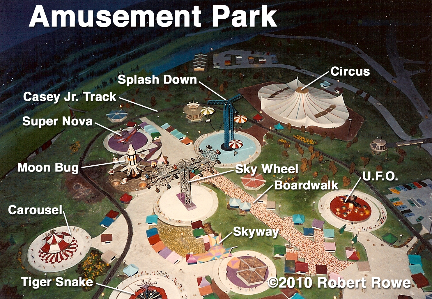
The amusement park pictured here is actually the amusement park from Walt Disney’s Progress City model.  This model spent seven years at Disneyland, before it was relocated to a spot along the WEDway PeopleMover track at the Walt Disney World Magic Kingdom.  The park is an amusement park due to some contradictory themes, but it came close to being a theme park.  Many of the attractions are based loosely upon the American Space Program.  With a little tweaking the entire park could have taken on an astronaut’s training center theme.  It’s no coincidence that the circus happens to look very much like the original artwork for Space Mountain. 

Sadly, at the time this photograph was taken, the model had already been chopped up to fit into its current location, leaving a third of the amusement park behind.  The park had also fallen into disrepair.  Most of the rides no longer work and the boardwalk’s Arcade Shops have been replaced with concession and ticket booths.  This sad state can be found in the real world too, when an operator neglects to maintain his property.

The theme park basics discussed here are extremely general.  Always consult with experts, regarding your specific needs, before making any significant investment into land and/or design.  Feel free to contact me.  I’ll be happy to assist you in your efforts.

Friday, August 27, 2010

Kettle Bedroom


Modern innovations were everywhere in the Kettle home, from the Universal feature-film The Adventures of Ma and Pa Kettle.  Even the master bedroom had its share of improvements.  Most notable was the “Murphy bed.”  This type of bed folds up and away when not in use; but for the Kettles that happened at the flip of a switch, always with someone still in the bed.
Once the bed was folded away, sliding doors would automatically hide it, giving the room a clean, modern look.

Like the other Kettle, SketchUp, interiors, this one still needs a good number of props and furnishings to be complete.  I had originally drawn this home to get a 3-dimensional feel for the space, and I hadn’t intended to furnish it out.  There are still seven more furniture items left for this room.  Additionally, there are four pictures, a mirror, four lamps and a number of smaller table props.

If readers are interested in seeing the Kettle interiors finished out, please post a comment, or drop me a line.  After all, making dreams come true is what I do.