Tuesday, August 31, 2010

Theme Park Circulation – The Wheel Plan


The original Disneyland circulation plan was laid out much like a star.  The Star Plan helped to keep visitors from becoming lost, and kept the various themed lands separated.  The only problem was that visitors had to go in and out of each land along the same walkways, doubling the traffic while making visitors feel that they weren’t making progress.

Some changes were needed.  It became apparent that the star really needed to be a wheel.  The Wheel Plan is not what Disneyland is today; but it is the plan used for Tokyo Disneyland.  Visitors need only travel halfway up Main Street before coming to the outer rim of the wheel.  The outer rim path is a short distance from almost every major attraction in the park.  But the best part is that the spokes of the wheel allow for short cuts that insure quick and even distribution of the visitors.

This plan is the ideal, and as Walt began to improve Disneyland he worked on his circulation plan joining lands where he could.  When he set his sights on an experimental prototype city of tomorrow (the original plan for Epcot), he came back to the wheel as the best circulation plan.

The theme park basics discussed here are extremely general.  Always consult with experts, regarding your specific needs, before making any significant investment into land and/or design.  Feel free to contact me.  I’ll be happy to assist you in your efforts.

Monday, August 30, 2010

Theme Park Circulation – The Star Plan


When Walt Disney first set out to build Disneyland he had a number of complaints about the current state of amusement parks.  Walt was not about to repeat any of the old mistakes. 

In the first place his park would be a theme park, instead of just an amusement park.  The park would be divided into five lands, and each land would contain a specific theme. 

In most amusement parks of the era, the parks had grown haphazardly.  There were many entrances from many parking areas, and the park layouts became confusing places where one was easily lost and discouraged. 

Walt wanted to tell a story, and the best way to do that was to control what the visitors saw, and when they saw it.  He needed a brilliant circulation plan.  Disneyland began with a circulation plan that I call The Star Plan.  Visitors would enter from a single point on the star (in this case off of Main Street) and that would lead to a central hub.  From this point visitors could choose any of the other four lands.  In each case the visitor would enter and exit from the same point and return back to the hub for a reorientation. 

This plan helped Walt to tell his stories without any visual contradictions, while helping the visitor to easily become familiar with the simple layout.  No one should feel lost, disoriented, or overwhelmed. 

The plan worked beautifully, until the number of visitors began to grow.  Each walkway had to accommodate twice the capacity of the land, because visitors had to travel the same way twice.  Visitors didn’t feel like they were making progress while exploring the park.  Some changes were needed.

Nevertheless, this is not a circulation plan that should be overlooked.  With proper planning it offers some sound solutions to circulation and storytelling.  Another important feature of the plan is the ability to quickly and evenly distribute visitors throughout the park, to maximize utilization of all facilities.

The theme park basics discussed here are extremely general.  Always consult with experts, regarding your specific needs, before making any significant investment into land and/or design.  Feel free to contact me.  I’ll be happy to assist you in your efforts.

Sunday, August 29, 2010

Theme Park vs. Amusement Park


So what’s the difference between a theme park and an amusement park? 

Well, both serve a very similar function of providing outdoor entertainment, rides and amusements.  The real difference is simply in the use of the theme.  In terms of outdoor recreation the theme is usually defined by unified architectural styles, eras, or geographic locations.

An amusement park is likely to have any number of rides and attractions in close proximity to each other, with contradictory themes.  An example might be a western style Log Ride, next to Aladdin’s Flying Carpet, next to Nascar Racers, next to Flying Saucer Spin.  Each ride has a theme, but the themes are contradictory to each other.

The theme park chooses a unified theme for the entire park, such as a Movie Studio; or a number of unified themes for a number of realms, lands, or zones.  Within the unified theme area contradictions are shunned.  The result is an immersive experience where visitors may, willingly choose to suspend disbelief.  This willingness to believe in the fantasy not only provides the visitor with a more satisfying experience; it also lowers the visitor’s resistance to paying for the privilege.

Because of the generally high level of quality and standards, the theme park also attracts a more discerning group of visitors, often representing all age groups, with more disposable income. 

On the other hand, the amusement park tends to attract a less discerning audience, usually made up of younger teens, from 13 to 24.  This group is less interested in theme and more interested in thrill.  The difficulty for the amusement park operator is that this group represents only a small fraction of potential visitors.  The amusement park operator must continually draw an audience from the same small group, year after year.  That usually means new, bigger, better, thrill attractions every year.

The theme park operator has a wider demographic and a wider choice of park additions.  A new parade can draw out returning family visitors at a much lower cost than a new attraction.

The amusement park pictured here is actually the amusement park from Walt Disney’s Progress City model.  This model spent seven years at Disneyland, before it was relocated to a spot along the WEDway PeopleMover track at the Walt Disney World Magic Kingdom.  The park is an amusement park due to some contradictory themes, but it came close to being a theme park.  Many of the attractions are based loosely upon the American Space Program.  With a little tweaking the entire park could have taken on an astronaut’s training center theme.  It’s no coincidence that the circus happens to look very much like the original artwork for Space Mountain. 

Sadly, at the time this photograph was taken, the model had already been chopped up to fit into its current location, leaving a third of the amusement park behind.  The park had also fallen into disrepair.  Most of the rides no longer work and the boardwalk’s Arcade Shops have been replaced with concession and ticket booths.  This sad state can be found in the real world too, when an operator neglects to maintain his property.

The theme park basics discussed here are extremely general.  Always consult with experts, regarding your specific needs, before making any significant investment into land and/or design.  Feel free to contact me.  I’ll be happy to assist you in your efforts.

Friday, August 27, 2010

Kettle Bedroom


Modern innovations were everywhere in the Kettle home, from the Universal feature-film The Adventures of Ma and Pa Kettle.  Even the master bedroom had its share of improvements.  Most notable was the “Murphy bed.”  This type of bed folds up and away when not in use; but for the Kettles that happened at the flip of a switch, always with someone still in the bed.
Once the bed was folded away, sliding doors would automatically hide it, giving the room a clean, modern look.

Like the other Kettle, SketchUp, interiors, this one still needs a good number of props and furnishings to be complete.  I had originally drawn this home to get a 3-dimensional feel for the space, and I hadn’t intended to furnish it out.  There are still seven more furniture items left for this room.  Additionally, there are four pictures, a mirror, four lamps and a number of smaller table props.

If readers are interested in seeing the Kettle interiors finished out, please post a comment, or drop me a line.  After all, making dreams come true is what I do.

Kettle Kitchen


The Kettle kitchen, from the Universal feature-film The Adventures of Ma and Pa Kettle, had all of the most up-to-date appliances that any home of the future needed in 1948.  An island, in the kitchen, housed much of the modern equipment.  Dishwashers did not become standard appliances until the mid to late 60s; but the Kettles had one.  Unfortunately, lazy Pa Kettle (Percy Kilbride ) let all of the appliances fall into disrepair and Ma Kettle (Marjorie Main ) ended up using the dishwasher to wash clothes by hand on a washboard.  The Kettle kitchen also contained a deep freezer that had ice cream frozen so solid that Ma needed an axe to break it apart.  Foot pedals operated the hands free sink, but Pa still managed to get himself splashed.

The most innovative appliance was the Infra-ray oven, probably intended to be some sort of an early microwave oven, it was supposed to cook food in seconds; and it incinerated Ma’s suckling pig roast.

This SketchUp model is still in development.  The period electric stove and a number of props are still needed to complete the picture.  

Thursday, August 26, 2010

Kettle Entertainment Center


What house of the future would be complete without a state-of-the-art entertainment center?  The 1948 Kettle house, from the Universal feature-film The Adventures of Ma and Pa Kettle, was filled with gadgets.  The entertainment center featured a built-in record player; hi-fi and big screen TV, all going to work at the push of a button (for those younger readers, a record player is an old-fashioned CD player, and a hi-fi is a radio).  The components were hidden behind sliding panels when not in use. 

These weren’t the only futuristic improvements in this model home.  There was a master control panel near the front door that controlled just about everything in the house.  According to the film:
“All of the lights, as well as many other features in the house, are worked by electronics.  The slightest pressure on this switch, and the lights go on… and off again.”
What will they think of next?  Pa had a silent-butler (ashtray that empties automatically) right in the arm of his armchair; only this one used a vacuum to clear away Pa’s mess.  There was even an electric-eye door leading into the kitchen.

This SketchUp model is still in progress.  I’ve added a few random props onto the entertainment center, just to add some life to it.  But I need to research, and add props that match the film, along with all of the other household furnishings.

Wednesday, August 25, 2010

Ma and Pa Kettle


In 1948, this house of the future was designed for the Universal feature-film The Adventures of Ma and Pa Kettle.  Pa Kettle won this prefabricated, international style home in a slogan contest.  The Kettles (Marjorie Main and Percy Kilbride) and their 15 children became the fish-out-of-water, country bumpkins living in a home of luxury, much like “The Beverly Hillbillies” would years later.  The Kettles would go on to make a series of seven films while living in this house.  Two more, less successful films, would be made without the house, or Percy Kilbride.

The house was originally built on Universal’s Stage 12, with a complete interior and exterior.  It underwent a number of changes for the first two films until settling on this basic design for the rest.  All but one of the films kept the house set on a stage.  In Ma and Pa Kettle at Waikiki the house was set up on the backlot of Universal Studios in front of another house. 

Although the dialog claims that the house was prefabricated, little in its design would lend to factory construction.  In fact, the extensive use of squeezed brick strongly supports a “stick-built” construction.

Tuesday, August 24, 2010

Tomorrowland Signpost


Way finding at theme parks is often overlooked today, but at Disneyland, in 1955, several signposts were located in every land.  This is an example of the Tomorrowland signpost.  All of the dimensions are estimated from photographs for this SketchUp model.  There were at least three of this similar design of signpost in Tomorrowland, and I presumed that they were all identical, with different signs pointing different directions.  My research found that the balls on top change color too.  Of the three posts that I found, one had a blue ball, one had an orange ball, and one had a yellow ball.

Today, few way finding signposts are left at Disneyland; but if you want to design your own theme park, they are a good idea if you don't want your guests to get lost.

Monday, August 23, 2010

Tomorrowland Ticket Booth


This was an interesting SketchUp model; a model found on Google 3D Warehouse inspired it.  The posted model looked very close, so I downloaded it and started measuring.  I quickly found odd measurements, and I didn’t like the photo-matched texture.  Before I knew it I had started over on my own version from scratch.  Although this booth is still designed strictly from estimates, it is likely much closer to the original design.

The booth appeared on opening day in front of the Rocket to the Moon attraction.  Later the first year, a similar copy of the booth showed up in front of the Astrojets.  Two central ticket booths of the same design appeared once Disneyland started selling ticket books instead of individual coupons at each attraction.

Sunday, August 22, 2010

Tomorrowland Tripod Lights


When Disneyland opened in 1955, it was struggling to create a sufficient number of attractions to lure guests.  In a pre-opening advertisement the outdoor lighting of Tomorrowland was spotlighted with this copy:

In Tomorrowland, aluminum spheres on 20 foot tripods accurately forecast future techniques in outdoor illumination.

The opening day Tomorrowland was intended to predict the far off future date of 1986!  Well, come the mid-eighties we didn’t exactly have tripod light poles on every street corner, but we did have track lighting.

This SketchUp model was created using the original advertisement art, and various photos, as reference.  The only dimensional information available was the 20-foot reference; all other dimensions are estimates.  The attraction posters were added to some of the tripods around 1956, or 1957.

Saturday, August 21, 2010

Theme Park Design – Shopping Districts


Shopping districts have become popular nearby some major theme parks.  These districts offer theme park guests an opportunity to continue their entertainment experience, after the park itself has closed.  These districts offer the park operator another marketing opportunity as well.

Universal Studios Hollywood was the first to try such a district under the name of City Walk.  The district is positioned to force park guest to pass through it both coming to, and going from, the park.  The shopping district is filled with unusual shops, restaurants and architecture.  The unique mix of retail is planned to compliment the park without competing with local area malls.  The park operator can operate the shopping district, or lease the space to other retailers.  The most important consideration is making sure that the mix of shops and prices match the tastes and budgets of the park guests.  The clientele of some high-end shops may look down at theme parks as low-end purveyors of crassness.  These are not the tenants you’ll want.

Disney saw the potential of City Walk and added Downtown Disney to the mix at Disneyland, Paris and Disneyland resort in California.  At Walt Disney World, Disney already had a Shopping Village in the Lake Buena Vista area that was first expanded to include the nightclub entertainment of Pleasure Island, and later, with more additions, it became Downtown Disney.

One downside of these shopping districts can be the lack of attendance during the park’s operating hours.  A related downside is the evening operation of the shopping district where there may not be a demand.  Also, nightclubs and establishments serving alcohol may not be compatible with the theme park’s image, or the desired clientele.  Where gambling is legal, gaming can be provided.  Gaming brings a whole new set of considerations to the mix.  Will gaming cause families to separate, leaving children unattended in the park?  Will children, left unattended in the park, be safe?  Many questions need to be answered and studied prior to these decisions.

For preliminary design purposes the shopping district, for a theme park expecting 3-5 million annual visitors, should add an additional 40 acres to the overall site plan.  I have shown the comparative acreage on the map, but I have not positioned the shopping district as strategically as possible.  Approximately 30 of the acres will be devoted to additional parking, with about ten acres left to the shopping district itself. 

Today, it is important to perform a very comprehensive feasibility study, covering all aspect of the theme park program.  Due to the sudden change in the US economy the shopping district may not be as good of a choice as it was only a few years ago.  Discretionary spending is down across the nation and it may remain low even after the economy recovers, due to new spending patterns.  It will be difficult enough for the new theme park operator to generate park visitations.  The wise operator may choose to provide the real estate for a future shopping district, without adding the capital expense of construction to the theme park’s first phase.  A strategic master plan could allow this extra acreage to serve as future expansion for the shopping district, or for the theme park, or hotel.

The theme park basics discussed here are extremely general.  Always consult with experts, regarding your specific needs, before making any significant investment into land and/or design.  Feel free to contact me.  I’ll be happy to assist you in your efforts.

Friday, August 20, 2010

Theme Park Design – Hotels


Hotel accommodations have been an important part of the theme park mix since Disneyland first began.  Walt Disney was very cash strapped while building Disneyland and adding his own hotel, at the time, was beyond his means.  Walt struck a deal with his good friend, Jack Wrather, to provide the hotel – Walt would provide the name and the guests.  The Disneyland Hotel occupied approximately 40 acres and grew from a few hundred rooms to over one thousand. 

When Walt moved to Florida he was looking to stretch his control over the guest’s experience, and he wanted to add his own theme hotels.  Two hotels were planned for opening day with a total of 1,500 rooms.  Nearby, in Disney’s own town of Lake Buena Vista, Disney leased several hotel sites to outside operators.  Disney World would expand its own hotel operation only when it was financially feasible.  In the meantime, outside operators could have some of the spillover business at high season, and take all of the risk.  The result of this strategy enabled the Disney hotels to maintain 99% occupancy, while the rest of the industry ran at only 70%.

When Disney went to Paris they made a big miscalculation in hotel rooms.  In 1955, the original Disneyland needed about 500 rooms while park attendance grew to 7 million.  In 1971, Disney World opened with 1,500 rooms with park attendance of 8-10 million.  Disneyland Paris opened with around 2,500 rooms for park attendance of only 8-10 million.  Unfortunately, there are outside factors involved beyond the number ratio of hotel rooms to the park attendance.

In Orlando, Florida, back in 1971, there were less than 2,000 rooms in the city.  The park desperately needed to provide its own accommodations.  But in Paris, in the 1990s, there were thousands and thousands of rooms in one of the most exciting cities in the world.  Disneyland Paris guests could easily stay in Paris and take a train to the park for a day trip.  There was no reason to stay so close to the theme park.

The Disneyland Paris theme park hit its expected attendance goals during the first years of operation, but the high price of empty hotel rooms caused the entire resort to suffer and tainted the project as an initial failure.

When planning a new theme park an onsite hotel is a good consideration.  For an attendance of 3-5 million, plan a hotel of 250 to 500 rooms on a 40-acre site.  A good hotel design will allow the 500 rooms to grow up to 1,000 without a huge expansion to the back-of-house, administration, retail and dining areas of the hotel.  Make certain that your feasibility study supports this level of development before proceeding with land purchase, or design.

The theme park basics discussed here are extremely general.  Always consult with experts, regarding your specific needs, before making any significant investment into land and/or design.  Feel free to contact me.  I’ll be happy to assist you in your efforts.

Thursday, August 19, 2010

Theme Park Design – Size


Presuming that you have done your homework, selected the perfect site for your theme park, and begun a comprehensive feasibility study, you’ll need to know how much land to buy.  Walt Disney was never happy with the amount of land that he bought for Disneyland.  He began with 160 acres and today the Disneyland resort covers 510 acres and, in addition to the theme park and parking lot, includes three hotels.

But Disneyland is the number 2 theme park for attendance in the world, behind only the Magic Kingdom at Walt Disney World.  While this is a lofty goal to aspire to, it may not be the most realistic place to start.

For a theme park, ranging from 3-5 million visitors in annual attendance, 160 acres is actually a good size to start with.  This size excludes hotels, each of which should be estimated at about 40 acres.  Once the best location for your theme park is determined, you must consider land availability and price.  Purchase as much land as possible (you can always sell some later), but don’t purchase so much land that the theme park can’t reasonably repay the debt.

The theme park should cover approximately 60 acres.  The park maintenance and service area should cover approximately 10 acres with additional service roads and area included within the theme park itself.  The guests and employee parking area, along with necessary buffer zones, should cover approximately 90 acres.  (As Disneyland attendance increased towards 10-12 million annual visitors the parking lot added approximately 60 acres, for a 150 acre lot, while the theme park added only about 20 acres.)  Parking capacity is estimated at 400 square feet per vehicle.  This is not just for the parking stall, it include a percentage of circulation roads as well.  These rough areas will give you an idea of what kind of acreage to look for before settling on a site.

The theme park basics discussed here are extremely general.  Always consult with experts, regarding your specific needs, before making any significant investment into land and/or design.  Feel free to contact me.  I’ll be happy to assist you in your efforts.

Wednesday, August 18, 2010

Theme Park Design – Highways


Across much of the rural United States, land was divided into one square mile sections for agricultural use.  Country roads often ran in grid patterns between the sections.  As towns and communities began to grow up around the farms, sections were further divided and the modest roads gave way to streets, boulevards and highways.

When choosing a site for your theme park, you’ll want to make sure that the site offers easy access to major highways.  The closer that your project is to existing highways the better, otherwise you may need to petition state and local authorities to add new roads; or worse yet, take on the responsibility and investment of building your own roads.

Disneyland was well positioned in an area of orange groves that was giving way to development.  A quarter section of land (one quarter of one square mile, or 160 acres) was originally purchased just off an existing boulevard, and nearby the (still under construction) Santa Ana Freeway.

You may not be so lucky when choosing your site.  Full sections (640 acres), half sections (320 acres) and quarter sections of land (160 acres), are not easy to come by near existing population bases.  Zoning restrictions may keep your project clear of new urban sprawl housing developments.  It might be possible to locate developed property, such as closed factory sites, large enough, with proper zoning and easy highway access.  But a site with existing buildings comes with its own set of problems, such as demolition and, sometimes, toxic waste cleanup.

Other outlaying areas will often include many natural features such as lakes, protected watersheds, hills, and forests.  Those irregularly shaped properties can provide many natural scenic wonders that can be used to your projects best advantage; although these features will often lead to an increase in land needs.  Those sites may also be located farther off the beaten track.  Make certain that you investigate your ability to have easy highway access to your project.

For simplification purposes I will discuss projects built upon standard sections of land, presuming that an adjacent highway, or boulevard borders the property.  The basic principles of theme park design remain the same despite the location and size of your property.

The theme park basics discussed here are extremely general.  Always consult with experts, regarding your specific needs, before making any significant investment into land and/or design.  Feel free to contact me.  I’ll be happy to assist you in your efforts.

Tuesday, August 17, 2010

Theme Park Design – Visitors


The most important step in designing a theme park is determining the best location.  Before design can begin, you must know what kind of weather to expect and what kind of population the park has to draw from.

Once you have found the perfect location for your theme park, how many visitors should you expect?  By the end of Disneyland’s first summer season the park had 1.2 million visitors.  In 1956, the first full year of operation greeted 3.8 million visitors and that number steadily grew to 6.7 million in 1966, the year that Walt Disney died.

In 2008, Magic Kingdom in Florida attracted an estimated 17 million visitors and Disneyland California attracted an estimated 14.7 million.  The remainder of the world’s top five (all Disney parks) ranged from 12-14 million.

Within the top 10, number 10, is Everland in South Korea at 6.6 million visitors.  Number 11, through 15, range tightly at 5-6 million visitors.  But unless your park can perform in the top 25, you should probably expect around 3 million visitors a year.

The number of visitors that your theme park attracts every year is the most critical number that you will need before you start to design.  From this number all other design decisions can be made.  Unfortunately, if you guess wrong with this number you can end up wasting millions on unused capacity, or lose out on potential revenue due to long lines and unavailable capacity.

Once you’ve settled on a location it is imperative that you consult with experts to determine your estimated attendance.

I would recommend two companies for feasibility studies.  Both companies are made up of former Disneyland executives.  The first company is VisionMaker.  I have employed the expertise of VisionMaker for my own secret project with pleasant results.  Although I have not worked directly with Apogee this is another company with experts in the field of theme park feasibility.  Click on the company names to visit their Websites and learn more for yourself.

For the 2008 attendance estimates I used this Website.

The theme park basics discussed here are extremely general.  Always consult with experts, regarding your specific needs, before making any significant investment into land and/or design.  Feel free to contact me.  I’ll be happy to assist you in your efforts.

Monday, August 16, 2010

Theme Park Design – Location


So you wanna design a theme park?  The first three rules of theme park design are: location, location, location.  Just like any real estate venture the most important consideration is to find a location that best suits your business and supports your clientele. 

For the theme park, that is likely a location that is conducive to year round leisure.  There are exceptions to every rule, and some successful theme parks operate only during certain seasons of the year.  It would therefore be helpful to checkout other seasonal competition if the location that you are interested in has a more difficult climate.

The film industry ended up in Hollywood California because of the weather.  At the time it relocated from New York, many silent films were shot outdoors (even for interior locations) in order to have enough light.  Southern California offered an excellent climate for outdoor shooting.  The establishment of Hollywood gave Walt Disney a film community to make, first his cartoons and full-length animated features, and later his live-action films.  It also offered Walt an excellent, nearby, location for Disneyland.

Sunshine and beaches have made Southern California a popular tourist destination for decades.  In 1950, the population of California was about 10.6 million people.  Having a population base to draw from is critical to the success of any theme park.  Disneyland historically attracts 70% local visitors (from Southern California) and 30% out-of-state, and Northern California visitors.

For Disneyland Paris, the population of the Paris metropolitan area, in 1990, was 10.3 million.  Obviously, the larger the population base, the better the chances are of attracting visitors.

The theme park basics discussed here are extremely general.  Always consult with experts, regarding your specific needs, before making any significant investment into land and/or design.  Feel free to contact me.  I’ll be happy to assist you in your efforts.

Sunday, August 15, 2010

Theme Park Design


I expect that some of my readers might be interested in designing theme parks themselves.  So, starting on Monday, I’ll be posting five days of theme park design basics.  Even seasoned professionals in the theme park business sometimes overlook the information that I’ll be posting.  But overlooking these point can cost millions.

The theme park basics discussed here are extremely general.  Always consult with experts, regarding your specific needs, before making any significant investment into land and/or design.  Feel free to contact me.  I'll be happy to assist you in your efforts.

Saturday, August 14, 2010

Pleasantville


With my enthusiasm for mid-century design, it was a forgone conclusion that I would enjoy the art direction from the feature film, Pleasantville.  The entire Main Street area was constructed new for this film, in the parking lot of a California State Park.  After the film was completed the entire street was struck (removed) along with any evidence that it was ever there.

Despite the theme of the film, I’ve chosen to render Pleasantville in full color, rather than just black and white.

I have no drawings from this film and I had nothing to work from except for my knowledge of how big things are.  If one knows the size of a brick one may count bricks and determine the size of a building.  I created the entire street, in SketchUp, from study and speculation.  I found lampposts in Google 3D Warehouse, but I wasn’t happy with them so I built my own.  The only thing borrowed is the 50s car.

Friday, August 13, 2010

Garfield


The Twentieth Century-Fox, 2004, feature film, Garfield, was actually filmed on the Universal Studios backlot.  Elm Street had been created specifically for the Universal, 2003, feature film Hulk.  Five houses were built just for the film, with a sixth house left standing from the film, To Kill A Mockingbird.

This house, although built for the Hulk, never even made it to the screen.  Like many of the houses on the new street, it is a craftsman bungalow.  It was brightly painted to fit into the comic world of Garfield.

This SketchUp model took me three days to complete.  This is just one view among the endless views available from a 3-dimensional model.

Thursday, August 12, 2010

Brady House


This is my SketchUp interpretation of  “The Brady Bunch” house.  The entry area comes from some research information, but the rest of the house is purely estimated.  The house used for the television series was not a backlot set, it was an actual location house.  I have an architectural book with some information for a similar split-level house, and I used it as reference to the design. 

A house of this general shape is usually a split-level, meaning that from the front door one would go up only half-a-level to the bedrooms and down half-a-level to the garage/playroom/basement.  The main living/kitchen/dining level would be off to the right (in this illustration), mid-way between the other two levels.

Of course, the interior was portrayed on screen as a standard two-story house.  If one would try to stack the two levels, seen on screen, the upper level would cantilever oddly off to one side.  The set design created a house of nearly 4,000 square feet, while a real house of this size is likely around 2,000 square feet.  As huge as the interior portrayed on screen would be, there would be nothing under the forward facing gable roof (to the left side) of the house.  The style of this house would be called contemporary (even if it is now only contemporary to the late 60s and early 70s).

I’ve chosen a SketchUp rendering style that has the feel of an architectural rendering (since dad, Mike Brady, was an architect).  The clouds and logo were added in Photoshop.

Wednesday, August 11, 2010

Lost in Space – Details


I received a compliment on the details in my work, so I thought that I’d share a few of them today.  This is a close-up of the automatic pilot instrument from the “Lost in Space” spaceship.  I actually have no idea of what was really “under the hood” of this instrument.  My research had found no drawings of this area.  I have only had photos to work from.  Unfortunately, there are few good photos to really help with an understanding of this instrument.

For most designers the best way to work out the details is to have some knowledge of how things work.  The automatic pilot had two moving parts.  First, the spaceship miniature in the center rotated like a top.  In order to do this the spaceship needed a rod that would extend down to a belt, connected to a vertically mounted motor.

Second, the top assembly, along with the spinning spaceship, could rock.  That means that the entire top assembly, including the spaceship, its rod and motor, all need to be connected to the top plate.  An armature needs to be capable of supporting the top plate and the rocking motion.  Then a horizontally mounted motor, with a cam and lever action, can cause the top plate to rock.

Lights are present on the top plate and each will need a socket and wire. 

Finally, the interior didn’t look busy enough (I’m sure that William Creber, the art director, had the same problem with the finished unit).  So I’ve added a number of random cylinders.  Bill Ryan, the electronics prop man for “Lost in Space,” had tons of surplus gadgets and wires to put in here.  In SketchUp, I’m still building an inventory of various parts and pieces; but it may not have mattered even if I’d had exact drawings of what was inside.

The most important decision that an artist makes on any work is to know when to stop.  How much detail is enough?  How much detail is too much?  For SketchUp drawings I look at the size of the file.  I try to keep my file size down to a minimum so that the drawings remain easy to work with.  I carefully consider what my likely point-of-views are for my illustrations.  Then I add detail only where I know I’ll be seeing it.

The level of detail in the automatic pilot instrument was based on the fact that it would not be examined this closely.  Still, it holds up well.

I won’t be adding anymore “Lost in Space” illustrations to the Blog for a while.  I’m supposed to be working on a “Lost in Space” book right now.  I’ll need to save my illustrations for that use.

Tuesday, August 10, 2010

Lost in Space


This is the interior of the spaceship as seen in the unaired pilot for “Lost in Space,” “No Place to Hide.”  Although the spaceship would later be christened the Jupiter 2, it was called the Gemini 12 in this version.  Only the most die-hard of fans can tell what's different.  It was created in SketchUp with the logo and some highlights added through Photoshop.

Monday, August 9, 2010

The Haunted Hotel


It occurs to me that much of my art depicts licensed properties.  There are some good reasons for that.  The most important reason is because I produce work-for-hire and as a result my clients want depictions of their licensed properties.  But most of my SketchUp work shown here is my own, and still it is from licensed properties. 

By illustrating licensed properties I don’t have to worry about my work being appropriated for use beyond promoting my talent.  One cannot publish my work without violating both my copyright and someone else’s licensing.  And a license holder is very likely to go after the culprits too.

Still, there are times when I get a chance to show-off some of my personal creativity.  The Haunted Hotel was produced for a client in the hotel industry, as office decoration for the Halloween season.  It was created in SketchUp with lightening and lighting effects added through Photoshop. 

For expediency, and fun, I’ve included some architectural details from the Munster’s house into this largely Châteauesque structure.  Although the added details are American gothic they work perfectly with this revival style, just as similar details work so well on the Châteauesque Hollywood Magic Castle nightclub.  Another fun thing about this model are the bats.  They have been placed randomly in the air and they actually work from any point of view.

Sunday, August 8, 2010

Fan 1


Today I’ll complete my SketchUp Fantasyland food facilities.  I’m not in any hurry to start building the Pirate Ship restaurant.

While I worked at Disneyland in Fantasyland Foods, I only worked about two days in Fan 1.  This was the Character Food Stand nearest to the Skyway, Dumbo, and the Fantasyland Theater.  Although I only worked here a few days, I was a frequent visitor, as many cast members were.  This food stand had a service window for the exclusive use of cast members, with food at a discount.  While working in food service I got my soft drinks for free, and the food was so inexpensive I could eat lunch for under 50¢.

I’ve changed rendering styles in SketchUp for this illustration.  This style has a sort of masonite background that gives renderings a warm, loose look.  The stand is nearly identical to Fan 2, with the exception of color and paint patterns.

Saturday, August 7, 2010

Welch’s Grape Juice Bar

I got an interesting comment on yesterday’s post: How about a rendering of the Welch's Grape Juice Stand's Mural? I know...probably a pipe dream!

Well, that all depends.  If you are looking for a rendering of the interior of the Welch’s Grape Juice Bar, including the mural, here it is (still in progress).  On the other hand, if you are looking for a rendering of an Eyvind Earle style forest, complete with a procession of centaurs and centaurettes, drawn as a three-dimensional model, then I might not be the best guy.

The drawing program that I use is called Google SketchUp.  This wonderful program is actually available for free downloads here.  The program is great for drawing 3-D models of buildings and other architectural shapes.  I’ve been able to do some remarkable things with this versatile drawing tool (see the House of the Future).  But 3-D people and animal shapes are something all together different.

The best drawing program for people is Poser (check it out here).  I had an older version of the program that I seldom used because it only let me build people.  The problem is that I usually design things.  The people, that I could build, floated in space.  Scenery could not be added.  As I understand, it is easier to import 3-D props and scenery into Poser today. 

But for me, I still enjoy drawing people by hand.  Also, as you review the work on my blog, you’ll notice that most of my people are stylized cartoons in one form or another.  I’m usually working hard at matching a particular animator’s style.  Trying to do so in 3-D may not be the best use of my time since most of my character work is used in 2-D art.

Still, recreating this wonderful scene in 3-D would be a great challenge for someone.


In the meantime, here is the juice bar with the mural in place.  (I work pretty fast.  This is just a few hours work after I read your question.)  A grape-arbor-like sign still needs to be added over the counter.  Then the real detailing would begin.  Cash registers, juice machines, cups and ice bins are just a few of the props needed to make the scene feel real.  Then I’ll need to finish out the exterior too, at least as far as my rendering can see.  Finally, I’ll probably add some people; but they will be 2-D cutouts that always face the camera.

It just occurred to me that perhaps you might want a line drawing, or painting, of the mural.  Simply copying the work of Eyvind Earle would not be something that I would enjoy.  I’d prefer to match his style and create a new scene, for a new purpose.  If you want to enjoy Eyvind’s original art then you might want to go here.

Please let me know just what you’re looking for.  After all, my job is making dreams come true.

Friday, August 6, 2010

Fan 2


The first job that I had at Disneyland was as a Utility Man in Fantasyland Foods.  The first place that they sent me was Fan 2.  This fast food stand didn’t have a name on a sign.  In guidebooks it was sometimes called “Character Food Stand.”  There were of course two stands of this similar design.  Fan 1 was located near the Skyway and Dumbo, and Fan 2 stood between Mr. Toad’s Wild Ride and Alice in Wonderland.

Captain Hook’s Pirate Ship and Welch’s Grape Juice Bar were also part of Fantasyland Foods.  I ended up working at all four of these locations spending most of my first summer at the Pirate Ship.  Later, I would transfer into attractions and work on every attraction in Fantasyland (with the exception of Storybook Land Canal Boats).

This SketchUp rendering is based upon the appearance of the stand in 1955.  By the time that I arrived, the roof had a slightly different paintjob and a crenellated ring sat at the outside edge.  In 1955, most all of the wastebaskets in the park were simply green.  The stand got a completely new pastel paintjob just a few years before it was demolished to make way for Fantasyland ’83. 

Fan 2 was located where the Mad Hatter Shop is located today.  My first rendering for this Blog is of a concept design for the Mad Hatter Shop in this location.

Thursday, August 5, 2010

Wonders of Life


When I first started using SketchUp, I realized that it was an ideal tool for visualizing complex, repetitive three-dimensional shapes.  An intriguing shape of this sort is the geometric dome.

I have never designed a geometric dome and I do not understand the specific mathematical calculations that are used in creating such shapes.  Sometimes it is a lack of knowledge that allows one to take on unknown challenges.

Using just a few published dimensions, along with many photographs, I determined the pattern of shapes used to create the Wonders of Life pavilion, at Epcot.  In this case the model was intentionally designed to be simple so as to keep its memory size low.  The model is of the outside surface only, without taking into account the actual thickness of structural members and panels.  Even so the model takes up 1.2 MB.

Wednesday, August 4, 2010

Kitchen of the Future


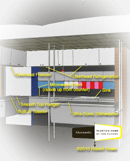
What House of the Future would be complete without a Kitchen of the Future?  The Atoms for Living kitchen of the Monsanto House of the Future was a showcase for a number of innovative kitchen designs.  Certainly, everything was made from plastic for easy cleaning.  And we’ve all heard that a microwave oven was installed here, years ahead of the consumer market.  But that's not all.

I think that the most interesting innovation was the ultra-sonic dishwasher.  Dishwashers of this type have been developed.  They not only do a thorough, yet delicate job of cleaning, they use less energy, save water, and use no cleaning solutions to pollute the environment.  It is because of this last point that we don’t have them today.  The same system could actually be used for clothes, but large detergent producers have been successful at keeping such devises off the market.  I wonder why?

Another innovation was the overhead refrigeration system.  The upper cabinets were actually the refrigerator and freezer.  The shelves would lower the contents to a convenient height at the push of a button.  Household overhead refrigeration units were actually produced during the mid-century (without moving shelves).  Perhaps the lack of standardization left them out of our kitchens of the future.  But they sure were conveniently located.

In addition to the microwave oven, the kitchen only had a two burner smooth top-range.  I guess TV dinners and store-bought cookies, were supposed to rule the menu.  And the final interesting addition was a four-slice toaster built into the counter-top.  It looked really cool to me, but I worry that all of the crumbs on the counter would end up in the slots, along with fingers.

Tuesday, August 3, 2010

House of the Future


The Monsanto House of the Future (also known as the Home of the Future) appeared at Disneyland from 1957, to 1967.  More than 6-million guests visited this plastic marvel during its ten-year run.

The rendering, produced in SketchUp, was a challenge due to the compound curving nature of the structure.  What is easily molded in plastic can be somewhat more difficult using computer aided drafting.  Much of the interior is completed on this work-in-progress.  The logo was added using Photoshop.  Still to come is the garden of the future that surrounds the house.

Monday, August 2, 2010

McDonald's Classic


This is a classic McDonald's walk-up stand with its towering golden arches.  The inspirational Googie styling allowed the entire building to serve as a marquee to passing motorist.  The original was perfectly suited to California highways, but the lack of indoor dining was not as well suited to the growing franchise as it moved across the country.

This rendering was produced in SketchUp.  The text was added in Photoshop.

Sunday, August 1, 2010

Statistics


On Thursday, Google Inc. triggered a false alarm by posting a notice that its search engine had been cut off from mainland China.  China and Google have had a number of differences regarding China’s intensions to censor Internet access.  China is specifically targeting information that it considers to be subversive or pornographic.

Fortunately, Making Dreams Come True is neither of those things.  On Thursday, there was no blockage here, as 11-visitors from China took a peek at what I have to offer.  I know this because Blogger now has a wonderful Stats viewer that allows me to see who’s seeing me.

Thursday was the first day that anyone from China took a look.  I had sent a link to associates in Singapore when I first started the Blog, but they haven’t been back since.  I know that I was being considered for a project in South Korea and one viewer from that country has visited.  There was one visitor from Japan too.

There have been 16-visitors from Canada, 3 of them came on Friday.  As for my 3-visitors from the UK, they haven’t been back in weeks.  The visitor that I’m most interested in is the one from Russia.  Come on back comrade, you’re welcome here.

I now know that the majority of visitors use Safari and a Mac.  But that is probably deceiving.  Of the 463-US visitors, I account for over a hundred visits myself.  The new Stats counter just doesn’t seem to be able to screen out the account holder.

Still, this is a wonderful way to track the traffic.  Walt Disney was an expert at Making Dreams Come True.  In order to do this, he believed that one had to know one’s audience.  The Stats counter allows me to do this.  If you use Blogger check your Stats out.  Who knows who’s looking?

If you don't have a Stats link on your Dashboard page, go to this URL for help.